Stephen T’s Blog Spot

A blog aimed at issues only data scientists, data analysts, statisticians, evaluators, and researchers care about.

  • The Pitfalls of Retrospective Data Collection

    A large share of the data we collect asks people to remember. How many times did you see a doctor last year? How much did you drink last month? When did the symptoms start? Since the program ended, have you found work? We treat the answers as records of what happened. They are not records. They are reconstructions, and memory reconstructs with a systematic tilt.

    The mind does not store events like a tape and play them back on request. It rebuilds them from fragments, cues, and present beliefs, and that rebuilding introduces error. The error is not random noise that averages out; it follows predictable patterns that push estimates in particular directions. Knowing the patterns separates a usable retrospective measure from a misleading one.

    Several patterns do most of the damage. Recall decay is the simplest: the further back you ask, the more is forgotten, so long recall periods undercount events, especially minor ones. Telescoping is sneakier: people misdate events, usually pulling them forward so they feel more recent, which inflates the count inside a bounded window like the past twelve months, because older events get dragged into it. Rounding and heaping pile responses onto salient numbers, zero, five, ten, about twice a week, distorting the distribution and its tails. And salience skews what survives at all, since vivid or emotional events are remembered while routine ones vanish, so rare dramatic behaviors are overcounted and frequent mundane ones undercounted.

    Then there is the pattern that turns error into bias. Current state colors memory: people who feel unwell now recall more past symptoms, and people who believe something helped recall their earlier situation as worse than it was. This is harmless as long as it operates equally across the groups you compare; it becomes dangerous the moment it does not. In a case-control study, people who have the disease search their memory harder for causes than healthy controls do, so the cases recall more exposure and an association appears that may not be real. This is differential recall, and it does not merely add noise; it manufactures or erases the very difference you are trying to measure.

    Evaluation has its own popular version. Asking people at the end of a program to rate where they were before it, thinking back, how confident were you at the start, is cheap and sidesteps some real problems with baseline surveys. However, it hands the respondent’s current beliefs about the program a direct channel into the baseline measure. If they think the program worked, they will tend to remember a lower starting point, and the design will produce an effect whether or not one occurred. A retrospective baseline is the easiest way to measure a program’s reputation and call it impact.

    The repair follows the diagnosis. Prefer contemporaneous measurement whenever you can afford it: capture data at baseline, use diaries or real-time prompts, or draw on records instead of memory. When you must ask retrospectively, shorten and bound the recall window, and anchor dating with calendars or landmark events to blunt telescoping. Offer specific options to recognize rather than forcing people to generate answers from nothing, and validate self-report against records where any exist. Above all, match recall conditions across your groups, so that any recall error is similar on both sides rather than concentrated in the group with the most reason to reconstruct the past.

    None of this is academic for program evaluation, which runs on retrospective self-report: exit surveys, follow-up interviews, questions that begin with since the program. The convenience is genuine; however, the recall structure quietly favors finding an effect, because the people most invested in a program are often the ones whose memory of before has been most reshaped by after. Treating memory as a reconstruction, whose errors are patterned and can differ by group, is the difference between measuring what a program did and measuring what people now believe about it.

    So here is my question. When your data depend on what people remember, do you account for the fact that memory is reconstructed and skewed, and that the skew may be larger in exactly the group you expect to benefit?

  • Understanding the Limitations of Member Checking

    A common and well-meant step in qualitative research is to take your findings back to the people who gave you the data and ask, does this ring true? It feels like the ultimate check. Who better to confirm an interpretation than the people it is about? This is member checking, also called respondent or participant validation, and it is often treated as the gold standard of qualitative rigor. Return your account to participants, and if they endorse it, it must be accurate, and if they reject it, it must be wrong. The instinct is good; however, the logic in its strong form does not hold. Agreement and accuracy are not the same thing, and neither are disagreement and error.

    Consider why a participant might agree with an account that is not faithful to the data. They might agree because it is easier than arguing, because the researcher is an authority, because they do not want to contradict a polished document, or simply because they are being polite. Agreement can be social rather than epistemic. And a study that only checks back with the participants likely to nod along is not validating anything; it is cherry-picking its own confirmation.

    Now consider why a participant might reject an account that is accurate. Good qualitative analysis usually produces interpretations that go beyond what any single person would say about themselves. It connects themes across many accounts, names a pattern no one participant lived as a whole, and situates individual stories in a larger frame. A participant may not recognize their own words in that higher-order reading, and non-recognition is not the same as the interpretation being wrong; the analyst’s job was never to simply transcribe each person’s self-understanding. Participants also sometimes reject a finding precisely because it is accurate and unflattering, and people change, so by the time you check back they may reinterpret the experience they first described.

    Underneath all of this is a single confusion. Member checking quietly merges two different questions: is this account faithful to the evidence, and does this participant endorse it? Those can come apart in both directions, which is why endorsement cannot serve as a truth test. It is the same lesson an earlier post drew about triangulation, that agreement across sources is not automatically a stamp of validity: a thing can feel confirmed without being correct.

    None of this means you should stop. It means you should stop treating it as a verdict and treat it as what it is: a source of data and a relationship, not a vote. A participant’s reaction to your interpretation is itself rich material worth analyzing, and disagreement especially is informative. When someone pushes back on a theme supported by many others, the theme does not fall, but the pushback is a case worth understanding, the qualitative equivalent of hunting for the exception that tests your account. Member checking also catches plain factual errors, and it honors participants by giving them a say in how they are represented, which matters on its own ethical terms.

    Doing it well means being clear about what you are asking. Are you checking facts, or seeking reactions? Treat the responses as data to be interpreted, not ballots to be counted. Expect disagreement and welcome it. And never let a participant’s endorsement or objection quietly override the weight of the evidence. What you should not do is write that member checking confirmed the findings, as though that sentence settled the matter.

    In evaluation this lands close to home. We routinely take findings back to program staff, participants, and stakeholders, and the pressure is real to read agreement as validation and disagreement as a problem to manage. Both are errors. Those reactions are invaluable, as data, as ethics, and as a route to use, but a program’s staff endorsing a flattering finding does not make it true, and their rejecting a critical one does not make it false. Keep the reaction and the evidence in separate columns.

    So here is my question. When you take your findings back to the people they are about, are you testing whether the account is true, or learning how they respond to it, and do you keep those two firmly apart?

  • Identifying Bias in Linked Data Sets

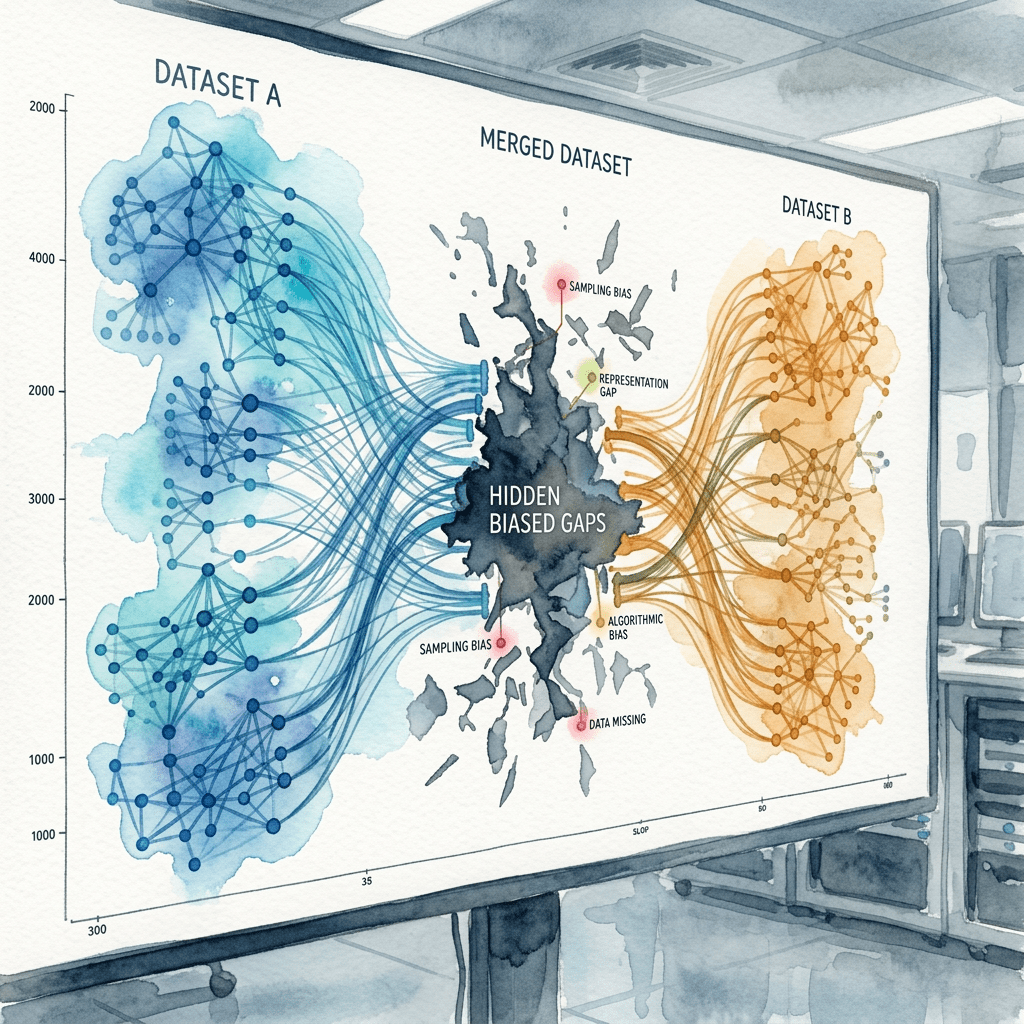
    A great deal of modern research and evaluation runs on linked data. We connect a program’s enrollment file to earnings records, a survey to health claims, a benefits roster to death records, and suddenly we can follow people across systems we could never afford to track ourselves. The catch is in the joining. When two datasets do not share a clean, reliable identifier, and usually they do not, we match on names, dates of birth, addresses, and partial identifiers. That matching is never perfect, and its imperfections are not random.

    Linkage produces two kinds of error, pulling in opposite directions. A false match joins two records that belong to different people, when common names, shared birthdates, or transcription errors make strangers look identical. A missed match fails to join two records that belong to the same person, when a name changed at marriage, an address moved, a field was blank, or a digit was mistyped. One invents a person who is not there; the other loses a person who is.

    The heart of the problem is that these errors are not spread evenly. Whether a record links correctly depends on the quality and stability of its identifiers, and those depend on who the person is. People who move frequently, change their names, hold common names, or appear in lower-quality records are systematically harder to link, and those traits travel with age, income, housing stability, immigration status, and race. This is not hypothetical: in large administrative systems, missed matches have been shown to fall hardest on ethnic minorities, people in deprived areas, foreign nationals, and those with no fixed address. The people who fail to link are not a random slice; they are disproportionately the mobile and the marginalized, often exactly the people an equity-focused evaluation most needs to see.

    That turns the linked dataset into a biased sample, tilted toward the easy to link, and the bias enters your results in two ways. If linkage is related to the outcome, whether someone is employed, or has died, or was readmitted, then the linked sample misrepresents that outcome, and you can manufacture or erase an effect through nothing more than who matched. And false matches attach the wrong record to a person, misclassifying an outcome in ways a clean-looking analysis never reveals. Because match rates differ by group, comparisons across groups are contaminated by differential linkage rather than real differences, which is how a study of disparities can end up measuring its own linkage.

    What makes this easy to miss is that the linked file arrives looking authoritative, one tidy row per person, often assembled by someone other than the analyst. The match rate may be reported as a single reassuring number, but a high overall rate can hide large gaps by subgroup, and the errors are baked in before analysis begins. Standard errors computed on linked data usually assume the linkage was perfect, so they come out falsely small. It is a fitness-for-use problem sitting upstream of everything you do.

    The discipline is to treat linkage as part of how the data were made, not a preprocessing footnote. Ask how records were matched, deterministic or probabilistic, on which fields, at what threshold. Examine match rates by subgroup, not just overall, and treat a differential rate as a bias to investigate rather than a nuisance to note. Where you can, check the linkage against a gold-standard sample and estimate which way the error pushes. And report honestly that your analytic sample is the linked sample, which may differ from the population in patterned ways.

    This is the nonresponse question from earlier in this series, moved to a new step. There the issue was who failed to answer, and whether it related to what you measured; here it is who failed to link, and whether it relates to what you measure. Same logic, same danger, further upstream. An impact estimate from linked data inherits every bias of the join, whether or not anyone looked.

    So here is my question. When you analyze linked data, do you know who did not link, and whether the reason they are missing is related to the very thing you are trying to estimate?

  • Predictive vs Explanatory Modeling: Key Differences

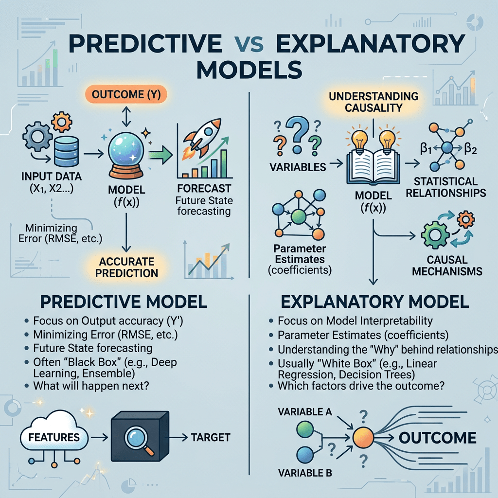
    Two questions sound almost the same and are not. One is: what will happen? The other is: why does it happen, and what should we change? A model can be excellent at the first and useless at the second, and confusing them is one of the most common and costly mistakes in applied analysis. It is getting more common as predictive tools spread into places that used to rely on explanation.

    Galit Shmueli drew the line cleanly in a 2010 paper whose title is the whole question: to explain, or to predict? Explanatory modeling tests a theory about why something happens, so it cares about getting the underlying structure and the coefficients right. Predictive modeling forecasts new cases, so it cares about one thing, accuracy on data the model has not seen. These are different goals, and they lead to different decisions at every step, from variable selection to model complexity to how you judge success. Start from the same data with different goals and you end up with different models.

    The reasons they diverge are worth seeing concretely. A predictive model will happily use a variable that is a downstream consequence of the outcome, or a proxy, or a common effect of two other things, as long as it sharpens the forecast. An explanatory model has to exclude exactly those, because putting them in corrupts the estimate of the cause you care about, a lesson this series has drawn before about controlling for the wrong variable. A superb predictor can be a terrible thing to adjust for.

    Bias behaves differently too. Prediction will accept a little bias in exchange for lower variance, since a slightly biased model often forecasts new data more accurately, which is why methods that deliberately shrink estimates toward zero are standard predictive tools. Explanation wants an unbiased estimate of the parameter even at the cost of precision, because a biased coefficient is a wrong answer to how much something matters. The best predictive model is often intentionally biased in ways an explanatory one could not tolerate.

    And success is judged differently. A predictive model is judged out of sample, on how well it forecasts cases it never saw, the discipline this series covered under overfitting. An explanatory model cannot be judged that way, because no accuracy score can tell you whether the assumptions that license a causal reading hold. A model can predict beautifully and carry a completely wrong story about why.

    That is where the real damage happens. The most common mistake is to build a model for prediction and then read its coefficients as if they explained. A variable that ranks high in predictive importance is not therefore a cause, and changing it will not necessarily change the outcome. Predictive importance answers whether something helps forecast, not whether it drives the result. Acting on a strong predictor as though it were a lever is how you try to change the temperature by adjusting the thermometer.

    The repair is unglamorous: decide the goal before you model, and say it out loud. If you need a forecast, optimize and validate for out-of-sample accuracy, and do not interpret the coefficients as causes. If you need to explain, or to decide what to change, build for identification, choose variables by their causal role rather than their predictive punch, and judge the model by whether its assumptions hold. Only the explanatory reading licenses the sentence change this to move that. Prediction tells you where to look; explanation tells you what to do.

    This is not abstract for anyone in government. Agencies increasingly run predictive models, risk scores, early-warning flags, targeting tools, and then face pressure to explain them and act on their inputs. A model that forecasts who is likely to drop out or be readmitted is answering a prediction question, and its most important features are not a menu of policy levers. Treating them as levers, or as an explanation of why a group scores high, is a category error with real consequences for who gets helped.

    So here is my question for the group. Before you build or trust a model, do you decide whether you are trying to predict or to explain, and do you resist reading a forecast as if it told you what to change?

  • Aligning Time to Avoid Immortal Time Bias

    Observational studies keep discovering that people who did a certain thing live longer. Patients who filled their prescriptions outlive those who did not. Heart transplant recipients outlive those on the waiting list. Oscar winners outlive the nominees who lost. Some of these gaps are real. Many are an illusion produced by a single, subtle flaw in how the groups were defined, and the flaw has a name: immortal time bias.

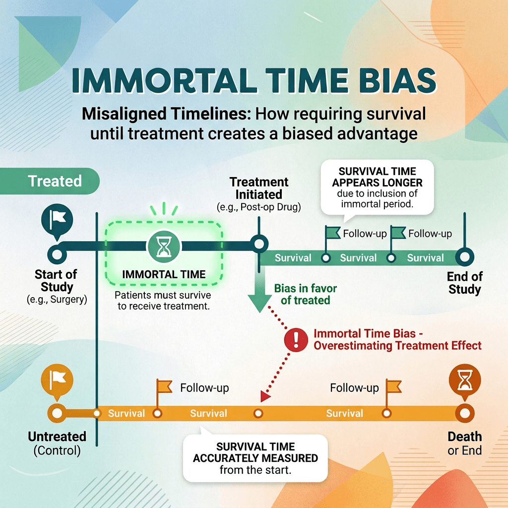
    The idea is easier to feel than to state. To end up in the group that filled a prescription, you had to live long enough to fill it. To count as a transplant recipient, you had to survive on the list until an organ arrived. To win an award, you had to be alive on the night it was given. The stretch of time between the start of follow-up and the moment you qualified is time during which, by the very definition of the group, you could not have had the event: if you had died, you would not be a filler, a recipient, or a winner, you would be in the other group. That guaranteed, event-free stretch is the immortal time.

    The bias appears when that immortal time gets handed to the treated group. In some studies it is counted as time under treatment, even though treatment had not started. In others, people who die during it are quietly moved into the comparison group or dropped. Either way, the treated group is credited with a block of survival no treatment produced, because that survival was a precondition for being in the group at all. The comparison is tilted before the treatment can do anything, and it tilts in a predictable direction: toward making the treatment look protective.

    The reason it is so easy to commit is that nothing about it looks like an error. The groups are real, the people genuinely received the treatment, the data are accurate, and the analysis is a standard survival model. The flaw is not in the measurement or the sample; it is in the alignment of time. The clock for the treated group effectively starts late, or their early, guaranteed survival is counted as if the treatment had earned it. That is why it slips past researchers careful about everything else.

    The most famous illustration is the finding that Oscar winners live years longer than other nominees, once offered as evidence that status and esteem lengthen life. But a winner had to survive to the ceremony, and to every later ceremony that made them a winner rather than a hopeful. When the advantage was reanalyzed with the time properly aligned, so that no one was credited for years they simply had to be alive to accumulate, most of the effect dissolved. The prize had not added the years; the years had been a requirement for the prize.

    The repair is to align the clock. Everyone’s follow-up must start at the same well-defined moment, and treatment must be handled as something that happens at a point in time rather than a label applied to a whole history in hindsight. In practice that means letting a person contribute untreated time until the treatment begins and treated time only afterward, or choosing a landmark moment and classifying everyone by their status then, discarding the immortal stretch. Most generally, it means specifying the study as the randomized trial you wish you could run, with one clear moment of eligibility and assignment, the target trial emulation an earlier post described, which was built precisely to make immortal time impossible.

    This is not only a clinical problem. Any evaluation built on administrative data where participation takes time to accrue is exposed. Compare people who completed a training program with those who did not, and remember that completers had to stay enrolled long enough to finish. The time they spent getting there can be silently credited to the program, so the apparent effect of completing is partly the effect of not having left early. Whenever the exposure is defined by something that takes time, ask whether the treated group was quietly granted immortal time.

    So here is my question. When your treated group is defined by something that took time to happen, have you checked that you are not crediting the treatment for the survival it required in the first place?

  • Transforming Appraisal: From Scores to Structured Judgments

    Its companion post argued that a single quality score is unreliable and often invalid, and that bias is not one property of a study but something specific to a mechanism and an outcome. That is the diagnosis. The repair is not a better scale. It is a different way of working, one that treats appraisal as transparent, structured judgment rather than a number.

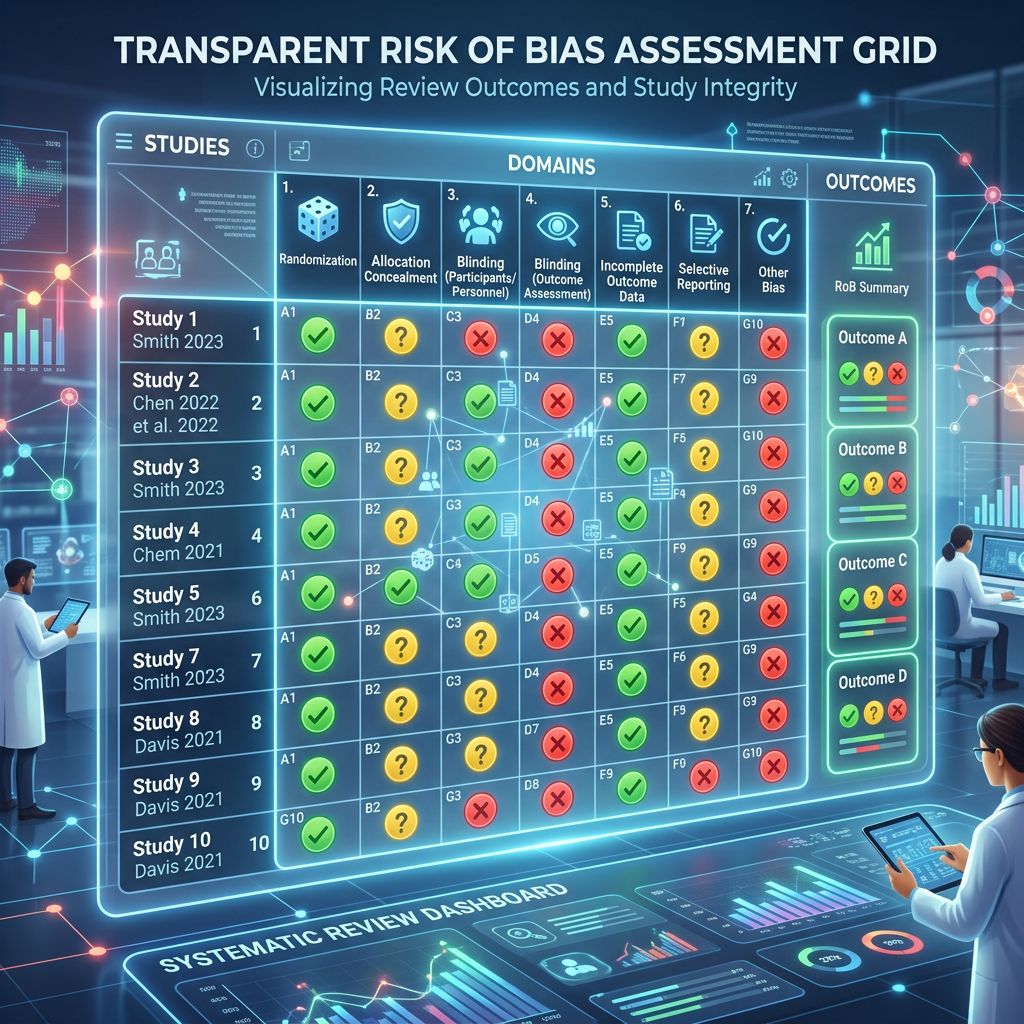
    Start by refusing to sum. The modern tools are built this way on purpose: the Cochrane risk-of-bias tool for randomized trials, and ROBINS-I for non-randomized studies, ask for a separate judgment in each bias domain, how participants were assigned, whether groups stayed comparable, how missing data were handled, how outcomes were measured, whether results were selectively reported, and keep those judgments apart instead of collapsing them into one figure. A study becomes a profile across domains, not a rank, which removes the arbitrary weighting that made summary scores indefensible.

    Not every domain carries equal evidence, so weight your attention accordingly. A few items have been shown empirically to predict distorted effects, concealment of allocation and blinding chief among them, and the meta-epidemiological studies tell you not just that they matter but when. Take those seriously. Be honest that other items on the checklist rest on expert consensus rather than demonstrated bias, and do not give a consensus item the same evidentiary weight as one with a track record.

    Because the same flaw bites differently depending on what is measured, appraise risk of bias for each outcome, not once for the whole study. A trial can be at low risk for an objective outcome like mortality and higher risk for a subjective one rated by unblinded assessors. Rating the study once, and stamping that rating on every result it reports, throws away the very distinction that matters most.

    Since two reviewers will disagree, manage it the way you would manage any unreliable measurement. Use two independent appraisers, write down decision rules before you start, pilot the tool on a few studies to calibrate, and record the reasoning behind each judgment so a reader can check it. The goal is not to eliminate judgment, which is impossible, but to make it transparent and reproducible.

    Here is the move that matters most, and it is one this series has made before in another setting. Do not use risk of bias as a gate that admits or excludes studies, and do not fold it into a weight. Use it as a sensitivity analysis: pool the evidence, then ask what happens when you restrict to the studies at lowest risk of bias. If the effect holds, the conclusion is robust. If it shrinks toward nothing once the most biased studies are removed, the bias was doing the work, and that is itself the finding. Risk of bias earns its keep as a question you ask of the result, not a filter you apply to the inputs.

    At the level of the whole body of evidence, this is what GRADE formalizes, rating certainty for each outcome by combining risk of bias with consistency, directness, precision, and the threat of publication bias. Used well, it communicates how much to trust a result. Used carelessly, its tidy structure can lend an unearned air of objectivity to a chain of judgment calls, so the discipline is to show the reasoning, not just the rating.

    The through-line of both posts is the same. The aim of appraisal is not a number that ranks studies but a transparent, domain-by-domain, outcome-specific judgment you can defend and stress-test. Grade the bias, for the outcome, out loud, and let the conclusion prove it can survive the least biased evidence.

    So here is my question. In your reviews, does risk of bias end up as a score that ranks studies, or as a question you put to the result to see whether it holds?

  • The Flaws of Quality Scores in Research Synthesis

    Every systematic review rests on a step that rarely gets questioned: appraising the quality, or the risk of bias, of each study it includes. To do that, reviewers reach for an appraisal tool, a checklist or a scale. What almost no one asks is whether the tool itself is any good. An appraisal tool is a measurement instrument, and when you hold it to the same standards it imposes on the studies it judges, reliability and validity, it often falls short.

    The oldest and most seductive form of appraisal is the summary quality score: run down a checklist, add up the points, and rank the studies by the total. That number feels objective and is anything but. It is a composite index, and it carries every problem a composite index carries, which items you include, how you weight them, how you combine them. The demonstration is now a classic: Jüni and colleagues scored the same trials with twenty-five different published quality scales and found that the choice of scale could change the conclusion of the meta-analysis, a trial ranked high by one scale ranked low by another. Sander Greenland had put it bluntly years earlier, that quality scores are useless and potentially misleading. The score launders a pile of judgment calls into one authoritative-looking figure, which is why the best modern tools refuse to produce one.

    Even setting the score aside, appraisal is less reliable than its users like to think. Give the same study to two capable reviewers and they often disagree. The Newcastle-Ottawa Scale, the most widely used tool for observational studies, is the cautionary example: it has repeatedly shown poor agreement between reviewers, and it was never formally validated. That means a risk-of-bias rating is not a fixed fact about a study. It carries measurement error of its own, and a rating from a single reviewer is a shaky foundation to build a conclusion on.

    There is a construct problem underneath the reliability problem. The idea of quality was always fuzzy, blending methodological rigor, completeness of reporting, and relevance, three different things. And an appraisal tool can only assess what the authors actually wrote down, so it partly measures how well a study was reported, not how well it was conducted. A careful study described carelessly gets marked down; a weak study written up smoothly can pass. The tool may be grading the prose as much as the science.

    The deepest issue is that bias is not a single property of a study at all. It is specific to a mechanism and specific to an outcome. The clearest evidence comes from trials: inadequate concealment of who was assigned to which group, and lack of blinding, exaggerate treatment effects substantially for subjective outcomes but barely at all for objective ones like death. The same design feature is a serious flaw for one outcome and almost irrelevant for another in the very same study. This should sound familiar: just as a survey does not have one bias but a different bias for each estimate, a study does not have one quality. So the statement that a study is high quality is not well formed. The honest unit of appraisal is a specific bias, for a specific result.

    The tool that grades the evidence deserves the same skepticism we bring to the evidence itself, and the single quality number is the least trustworthy thing the whole process produces. None of this means appraisal is hopeless. It means it has to be done differently, by domain, by outcome, and with its judgments made transparent rather than buried in a score. Its companion post takes up exactly that: if a single quality score fails, how should we appraise and use risk of bias instead?

    So here is my question. When a review tells you a study is high or low quality, do you ask which bias, for which outcome, and how reliably that judgment was reached?

  • Beyond Response Rate: Measuring Survey Bias Correctly

    The first question people ask about a survey is almost always the response rate. Sponsors set targets for it, reviewers judge studies by it, and a low one is often treated as a fatal flaw. The instinct feels unimpeachable: surely the more people who answer, the closer you are to the truth. But the response rate is a surprisingly weak guide to whether a survey is biased, and treating it as the grade leads people to trust the wrong surveys and dismiss the right ones.

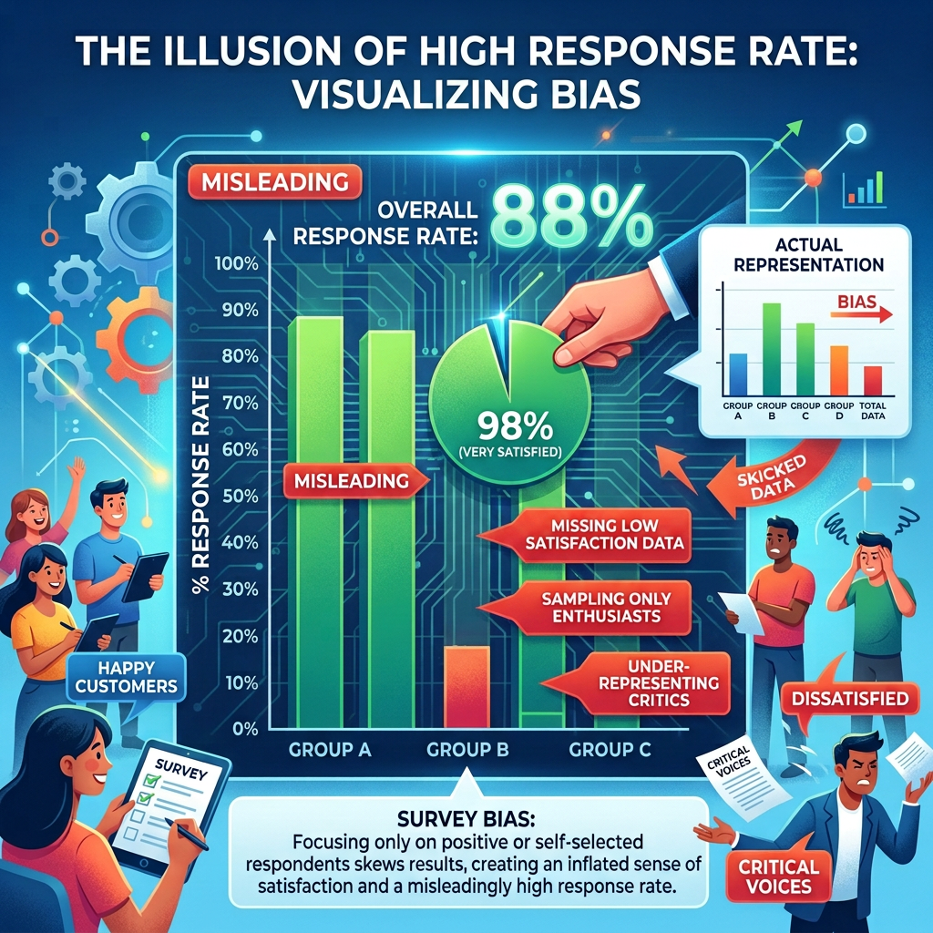
    Start with what actually produces nonresponse bias. It is not the number of nonrespondents on its own. It is the combination of two things: how large the nonresponse is, and how different the people who did not answer are from the people who did, on the specific quantity you are estimating. Roughly, the bias is the nonresponse rate multiplied by that difference. So if the people you failed to reach are, on the variable in question, just like the people you reached, a high nonresponse rate costs you almost nothing; and if the missing people are systematically different, even a modest nonresponse rate can produce a large bias.

    Because the response rate captures only one of those two factors, and misses the one that often matters more, it cannot by itself tell you how biased a survey is. Robert Groves and Emilia Peytcheva assembled fifty-nine studies in which the true values were known, so the real nonresponse bias could be measured, and they found very little correlation between the response rate and the bias. Surveys with low response rates were sometimes nearly unbiased; surveys with high response rates were sometimes badly biased. The number everyone treats as the quality grade barely tracked the quality, and pushing a response rate higher did not reliably shrink the bias.

    There is a subtler point underneath. Nonresponse bias is not a property of a survey; it is a property of each estimate within the survey. The same survey can be nearly unbiased for one question and badly biased for another, because who is missing matters differently depending on what you measure. A health survey that quietly loses the sickest people can be badly biased on health status while remaining almost unbiased on commute times. So a claim that the survey as a whole has low bias is not even well formed; bias lives at the level of the number, not the instrument.

    If the response rate is not the answer, what is? The question that matters is whether nonresponse is related to what you are measuring, which is the missing-data logic from earlier in this series, the difference between data missing at random and data missing for reasons tied to the outcome. In practice that means comparing respondents to known population benchmarks, using whatever frame or administrative information you have to see how respondents and nonrespondents differ, and where you can, following up a subsample of nonrespondents to measure the difference directly rather than assume it away. And it means reporting the risk of bias estimate by estimate, not as one response rate stamped on the whole survey.

    None of this makes the response rate worthless. A higher rate shrinks the multiplier, so it buys some protection against the worst case, and a very low rate leaves more room for trouble if the difference turns out to be large. The honest framing is that the response rate is a bound on the risk, not a measurement of the bias: it tells you how much room there is for a problem, not whether you have one. So clearing a federal response-rate threshold is worth doing, but it is not the same as solving the bias problem, and missing it does not automatically make a survey worthless.

    So here is my question for the group. When you judge a survey, do you stop at the response rate, or do you ask whether the people who are missing differ on the very thing you are trying to measure?

  • The Impact of Anchoring on Estimates and Decisions

    Someone says a number out loud, a budget figure, a timeline, a rough guess, and from that instant your own estimate is quietly bent toward it. Not because the number was correct. Often it was arbitrary, sometimes obviously so, and you knew it. Yet it moved you anyway. This is anchoring, and it is one of the most reliable and least escapable biases in all of human judgment.

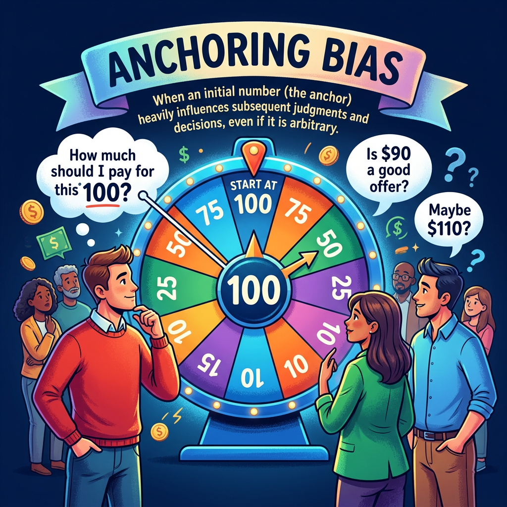
    The classic demonstration is almost unfair in how well it works. In 1974, Amos Tversky and Daniel Kahneman sat people in front of a wheel of fortune, numbered 0 to 100 but secretly rigged to stop on either 10 or 65. After the wheel landed, they asked each person whether the percentage of African countries in the United Nations was higher or lower than that number, and then asked for their best estimate. The people who saw 10 gave a median estimate of 25 percent. The people who saw 65 gave a median estimate of 45 percent. A number pulled from a spinning wheel, visibly random and plainly irrelevant to African geography, dragged the answers twenty points apart.

    The mechanism is a shortcut we all use. Faced with an uncertain quantity, we do not build an answer from nothing. We grab whatever value is nearby and adjust away from it, and the adjustment is almost always too small. We stop before we have moved far enough, and we come to rest closer to the anchor than we should. Any number in the vicinity becomes the starting line, whether or not it has any right to be.

    Here is the part that should worry us. Anchoring does not go away when you know about it. It survives explicit warnings, it survives knowing the anchor is random, and it survives paying people to be accurate; Tversky and Kahneman found that offering rewards for correct answers did not shrink the effect. Later work showed that even absurd anchors work, that asking whether Einstein first visited the United States before the year 1215 anchors people about as well as a plausible date. Expertise is thin protection, because experts anchor on irrelevant numbers much like everyone else. You cannot simply resolve not to be anchored.

    In our line of work the anchors are everywhere, and they arrive early. A client mentions an off-hand budget, and every cost estimate that follows orbits it. A previous contract’s price becomes the gravitational center of the new one. In a negotiation, the opening offer sets the terms of the whole exchange, which is why a first number, even an aggressive one, is so powerful. And when we lean on expert judgment, asking a panel to estimate an effect size, a prevalence, a risk, showing them a preliminary figure quietly contaminates the judgment we came to collect.

    Because willpower does not work, the defenses have to be structural. Collect estimates independently before anyone says a number aloud, so no single figure anchors the group. When an anchor is unavoidable, make it a defensible one: replace the arbitrary starting point with real reference data, the distribution of similar past projects, which is the outside view this series has praised before. Force yourself to consider the opposite, generating reasons the true value could be far higher or far lower before you settle. And ask for a range built from evidence before anyone commits to a point.

    The through-line is simple. The first number in the room is doing work, whether or not it has earned the right to. Half the discipline is noticing that it is happening at all. The other half is arranging the process so the anchor that shapes the answer is a piece of evidence you chose on purpose, not a figure that happened to be said first.

    So here is my question. When your team lands on an estimate, do you know what number it started from, and whether that starting point was evidence or an accident?

  • The Ranking Is a Choice

    A single number that ranks things carries enormous rhetorical power. States ordered by vulnerability, hospitals by quality, countries by competitiveness, programs by performance: the ranking looks like a measurement, objective and settled. But a composite index is not a measurement in the way a thermometer reading is. It is a construction, assembled from many separate pieces through a chain of choices, and those choices, as much as the underlying reality, decide who ends up on top.

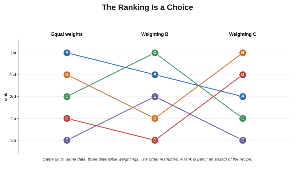
    Building an index means making at least four consequential decisions, each defensible and each arbitrary at the margin. First, which indicators to include, and which to leave out; the index measures only what you chose to put in it, so an omitted dimension simply vanishes from the ranking. Second, how to normalize them, since they arrive in different units and must be made comparable, and rescaling by z-scores, by a minimum-to-maximum stretch, or by ranks can give different results, especially with outliers. Third, how to weight them; equal weights feel neutral but are a strong assumption, and any set of weights is a statement about what matters more, usually chosen rather than derived. Fourth, how to aggregate; adding the pieces lets a high score compensate for a low one, while multiplying does not, so a weak spot cannot be bought back, and that choice alone can change the order.

    Because every one of these choices moves the ranking, the order is partly an artifact of the recipe. Two competent analysts, each making entirely defensible choices, can produce different rankings from the very same data. Formal studies of index construction show exactly this: as you vary the weights and methods within reasonable bounds, a unit’s rank can swing, sometimes dramatically. Andrea Saltelli, one of the field’s authorities, warned that an index built without a sensitivity analysis can be made to tell almost any story. A rank presented as a fact is often a choice presented as a fact.

    The real hazard is what this does to accountability. An index launders subjective judgments into an objective-looking number. The weighting decision, the most value-laden step of all, disappears into a formula, and the result emerges wearing the authority of arithmetic. People then treat the order as discovered rather than built, and they make real decisions, funding, targeting, oversight, on differences between adjacent ranks that fall well within the noise of the method. Position fourteen beats position fifteen, and a resource follows, when a slightly different but equally reasonable recipe would have swapped them.

    None of this means indices are useless; it means they should be treated as models, not measurements. Make every choice explicit: what went in, how it was scaled, weighted, and combined, and why. Then run a sensitivity analysis, varying those choices to see how stable each position is, and report the instability instead of hiding it. Distinguish the gaps that survive reasonable variation from the ranks that reshuffle at a touch. And resist false precision: an index may be serviceable for sorting units into broad tiers, high, medium, and low, while being close to meaningless for ranking one position against the next.

    For those of us working with federal programs, this is not abstract. Vulnerability indices, deprivation measures, risk scores, and performance rankings are used to direct money and to hold programs to account. When a funding formula or an oversight decision rests on an index rank, the construction choices behind that rank are not technical footnotes. They are policy choices in disguise, and they deserve the same scrutiny we would give any other policy choice.

    So here is my question for the group. When you use a ranking, do you ask how it was built and how much the order would move under different reasonable choices, or do you treat the number as the thing itself?

  • Understanding Uncertainty in Data Visualization

    Picture a simple bar chart. Two bars, one taller than the other. Your eye settles the matter in an instant: this group is higher than that one. But the chart has withheld the single fact you need in order to trust that reading, which is how much each bar could have come out differently by chance. Strip the uncertainty out of a picture and you have not made the result simpler. You have made it look more certain than it is.

    This is the quiet failure of most default charts. A bar is a single number. A line connects single numbers. A dashboard tile shows one figure in bold. Nothing on the page signals that each of those numbers is one draw from a distribution, that a rerun of the same study would have landed somewhere nearby but not identical. The crisp, confident geometry of a clean chart is a claim, and often an overclaim, made by omission.

    The consequences are concrete. Two bars that differ by a sliver can be statistically indistinguishable, their intervals heavily overlapping, and yet the picture shouts that one is bigger. A line that drifts upward can be indistinguishable from flat once you allow for noise, and yet a trend line reads as momentum. The viewer walks away with a strong conclusion the data does not support, and no one had to lie with a number to produce it. The chart did the overstating on its own, by leaving the uncertainty out.

    The remedy is to put the uncertainty back on the page. Add error bars or confidence intervals to the bars and points. Draw a shaded band around a fitted line or a forecast. Where you can, show the spread of the underlying data and not only the summary, because a mean conceals the distribution it came from. The aim is for the eye to take in the estimate and its uncertainty at the same time, so that the strength of the visual impression matches the strength of the evidence, no more and no less.

    Showing uncertainty well has its own traps, and two are worth naming. First, an error bar is meaningless until you say what it is. A standard deviation, a standard error, and a confidence interval describe three different things with three different widths, and readers routinely confuse them, so label them every time. Second, you cannot judge a difference by whether two intervals overlap. Overlapping confidence intervals do not prove there is no real difference, and separated ones do not prove there is one; the eyeball test is unreliable. When the difference between two groups is the point, the honest move is to show the uncertainty of the difference itself, not to leave readers comparing two bars by sight.

    Step back and this is simply the communication end of everything the series has said about uncertainty. A p-value, a confidence interval, an effect size with its range, these are all efforts to be honest about how much we do not know. A chart that shows only the point estimate throws that honesty away at the last step, exactly when the result reaches the people who will act on it. The picture is often the only part of a study a decision-maker ever sees, which makes it the most important place to tell the truth about what is uncertain.

    For those of us who build dashboards, briefings, and one-page summaries, the pressure to present a clean and confident picture is real, and it runs the wrong way. A bar chart of outcomes by site, with nothing to signal uncertainty, quietly invites a manager to rank the sites and act on gaps that may be noise. Adding the intervals is not hedging or clutter. It is the difference between informing a decision and inviting a mistake.

    So here is my question. When you put a result in front of someone who will act on it, does your chart show how much you do not know, or does it quietly promise a certainty you cannot back up?

  • Understanding the Table 2 Fallacy in Regression Analysis

    Open almost any study built on regression and you will find a table, often the second one, that lists the outcome regressed on a main variable of interest plus a row of controls. Each row carries a coefficient, an interval, and a p-value, lined up in a neat column. The natural thing to do is read down that column and take each number as the effect of that variable. It is one of the most common mistakes in applied statistics, and it has a name.

    The trouble starts with what the model was actually for. A multivariable regression is built to estimate the effect of one thing, the exposure or treatment you care about, and the other variables are included to remove confounding of that particular relationship. They are there to clean up the estimate for your main variable, not to have their own effects measured. Their coefficients are adjusted associations, conditional on everything else in the model, and that adjustment was chosen for your question, not for theirs.

    Here is why that matters more than it sounds. Confounding is not a property of a variable in isolation; it is a property of a specific pairing of a cause and an effect. A variable that is a proper confounder for your exposure can play an entirely different role for some other variable in the same model. It might sit on the causal path from that other variable to the outcome, a mediator, so adjusting for it strips out part of that variable’s real effect. Or it might be a common effect of two things, a collider, so adjusting for it opens a spurious association that was not there before. The very same regression that gives you a clean estimate for your exposure can hand you a badly biased estimate for a covariate, because the set of controls that is right for one is wrong for the other.

    Daniel Westreich and Sander Greenland named this the Table 2 fallacy in 2013, after the table where it usually happens. Their point was not that the model is broken. The model does its job for the exposure it was designed around. The error is in the reading: treating a table built to answer one causal question as if it answered a dozen at once.

    An example makes it concrete. Suppose you estimate the effect of a training program on earnings, adjusting for age, prior schooling, and motivation. For the training question, that may be a sensible set of controls. But if your eye drifts to the coefficient on prior schooling and you read it as the effect of schooling on earnings, you should not. Motivation may be a mediator of schooling, part of how schooling raises earnings, so adjusting for it removes some of schooling’s real effect. And the confounders you would need to estimate schooling’s effect properly, family background and the like, were never in the model, because the training question did not require them. The schooling coefficient is not the effect of schooling; it is a number shaped by a model built for a different purpose.

    The discipline is simple to state. Decide, before you model, which single effect you are estimating, and choose the controls for that effect. If you truly need the causal effects of several variables, that is several distinct questions, each deserving its own adjustment set and often its own model, not one table read greedily. When you must show the full output, label the secondary coefficients honestly as adjusted associations rather than effects, and resist interpreting them. And as a reader, do the same: find the one effect the model was built to estimate, and treat the rest as machinery.

    For those of us reading and writing evaluation reports, the temptation to mine a regression table for a dozen findings is strong, and it quietly misleads decision-makers about which factors matter. Estimating an effect is a question you answer one at a time.

    So here is my question. When you read a regression table, do you interpret only the effect the model was designed to estimate, or do you read down the column as though every coefficient were a finding?

  • Representativeness Is Not Always the Goal

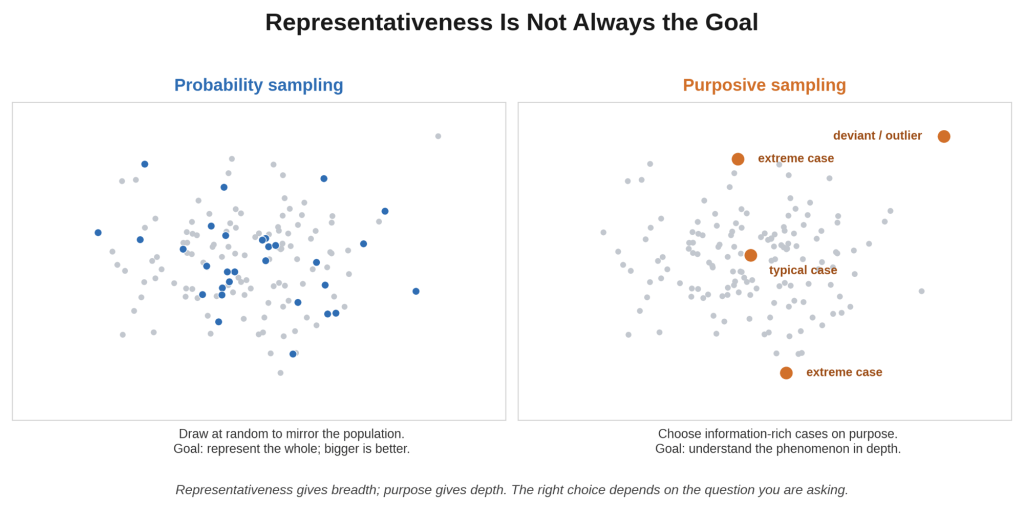
    Ask most people how to choose a sample and they will describe some version of representativeness: draw at random so the sample mirrors the population, and the larger the better. That instinct is right for one job, estimating a quantity in a population. It is the wrong instinct for much of qualitative work, where the goal is not to mirror a population at all. There, the point of sampling is to learn as much as possible about a question, and the best sample is the one that teaches you the most, not the one that looks most like the whole.

    This is purposeful sampling, and it is one of the defining features of qualitative inquiry. As Michael Quinn Patton puts it, the logic and power of the approach lie in selecting information-rich cases, the ones whose study will illuminate the question in depth. You are not trying to average across a crowd. You are trying to understand a phenomenon, and some cases reveal far more about it than others. Choosing those cases on purpose is not a compromise forced by a small budget. It is the method.

    The strategies differ because different questions call for different cases. Maximum variation sampling deliberately spans the range, so that whatever patterns hold across very different circumstances are likely robust, and the differences themselves are informative. Extreme or deviant case sampling goes to the outliers, the notable success or the striking failure, because the unusual case often exposes what stays hidden in the typical one. Critical case sampling picks the case that settles the matter: if it cannot work here, it will not work anywhere. And disconfirming case sampling seeks the examples that might break an emerging pattern, marking the boundary of a claim, the qualitative cousin of hunting for the case that breaks your theory.

    There is an even more dynamic version. In theoretical sampling, associated with grounded theory, you do not fix the sample in advance at all. You collect and analyze together, and the developing analysis tells you who or what to sample next: a concept is emerging, so you go looking for the case that will sharpen or challenge it. Sampling becomes a series of analytic decisions rather than a plan set before the first interview, and it continues until new cases stop changing the picture.

    This reframes the question people love to ask, which is how many. In qualitative work the honest answer is not a number from a power calculation but a judgment about information. Malterud and colleagues gave this a useful name, information power: the more relevant information your sample already holds, the fewer participants you need. A narrow, well-specified question studied through rich dialogue can be answered with a handful of well-chosen cases; a broad, loosely defined one may need many more. Sufficiency, not size, is the standard.

    Two honest cautions keep this from becoming an excuse. First, purposeful is not the same as convenient. Choosing the cases that are easiest to reach is the weakest form of sampling, information-poor and low in credibility, and it is not what any of this endorses. The selection logic has to be explicit and defensible, because purposeful sampling gives the researcher the power to shape the sample, and that power quietly becomes cherry-picking if the reasoning is not on the table. Second, this kind of sample does not generalize by statistics. It generalizes, when it does, by transferability: you give enough about the cases and their context that a reader can judge whether the findings extend to their own setting.

    It is worth noticing that this is the mirror image of an earlier post. A nonprobability sample is dangerous when you want to estimate a population, because its bias does not shrink as it grows. The very same nonprobability logic is the right choice when the goal is understanding rather than estimation. The tool did not change; the question did.

    So here is my question. When you choose whom to study, do you reach reflexively for a representative sample, or do you first ask what you are trying to learn and which cases would teach you the most?

  • Two Ways to Be Uncertain

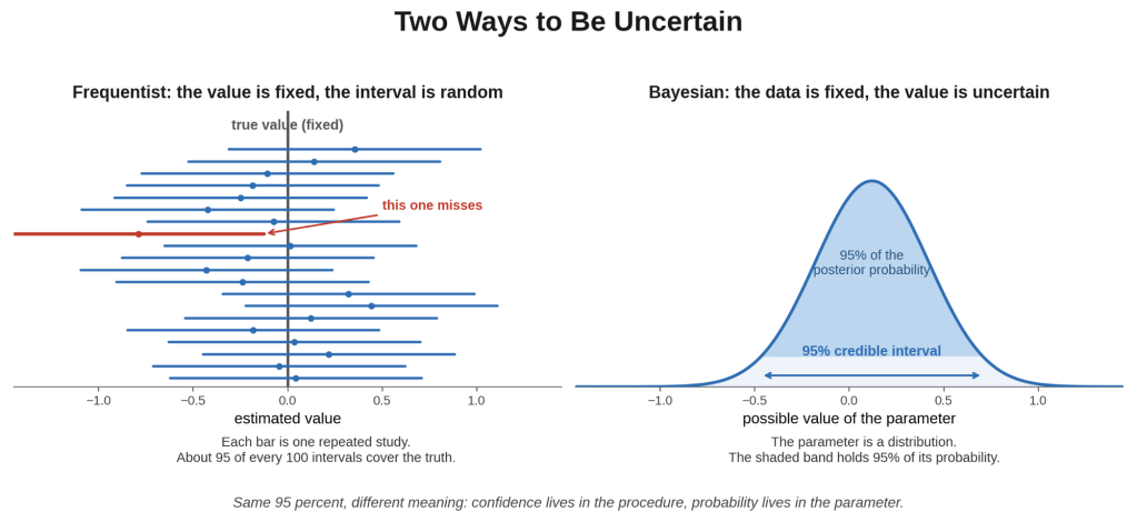
    You calculate a 95 percent confidence interval and describe it the natural way: there is a 95 percent chance the true value lies inside it. Almost everyone reads it like this, and it is wrong. Not because the arithmetic failed, but because you asked one framework of statistics for an answer only the other framework can give. Behind a surprising share of misread numbers is a quiet collision between two different ways of thinking about uncertainty.

    Start with the older and more dominant one. Frequentist statistics treats the unknown quantity you care about, the true effect, the real population value, as a fixed number. What is random is your data, drawn as one sample out of many you could have collected. So probability, in this world, describes how your procedure behaves over the long run. A 95 percent confidence interval means that if you repeated the whole study over and over, about 95 percent of the intervals you built that way would contain the true value. It says nothing about this one interval. The truth is either inside it or not; the confidence lives in the method, not in the particular answer sitting in front of you.

    The other framework turns the picture around. Bayesian statistics treats the unknown quantity as itself uncertain, something you hold a degree of belief about, and treats the data as the fixed thing you actually observed. You begin with a prior, an explicit statement of what you believed before seeing the data, you update it with the evidence through Bayes’ rule, and you end with a posterior, a full probability distribution over the unknown. From that you can build a credible interval, and it means exactly what people want a confidence interval to mean: given your data and your model, there is a 95 percent probability the value lies inside. It is the direct answer to the direct question.

    This is why the confusion is so universal. People are natural Bayesians. When we see a result, what we want to know is how probable the truth is, given what we saw, and that is a Bayesian question. But the standard tools of the last century, p-values and confidence intervals, are frequentist, and they answer a different question about the long-run behavior of a procedure. So we take a frequentist number and read a Bayesian meaning into it. The p-value becomes the probability the null is true; the confidence interval becomes the probability the truth is inside. These misreadings are not sloppy so much as wishful: the answer we actually wanted, projected onto a tool that cannot supply it.

    Neither framework escapes without a cost, and it is worth being fair about both. The Bayesian approach gives you the direct probability, but only by requiring a prior, and where that prior comes from is a real question. State it well and it encodes genuine knowledge; state it carelessly and a strong prior can swamp weak data and smuggle your assumptions into the answer. The frequentist approach refuses the prior and the subjectivity that comes with it, and pays by being unable to make any probability statement about the parameter itself, only about the procedure. With a neutral prior the two often produce nearly identical intervals: the numbers can coincide while the meaning does not.

    The practical point is not to pick a side. It is to know which question your number answers, and to resist reading one framework’s result as though it were the other’s. If a decision truly needs a probability about the thing itself, how likely it is that this program helps, and by how much, that is a Bayesian question and deserves a Bayesian method with a stated, defensible prior. If you want guaranteed long-run error properties and no reliance on a prior, frequentist tools are right, as long as you read them as statements about the procedure. The error is never choosing one; it is using one and interpreting it as the other.

    So here is my question. When you report a confidence interval or a p-value, are you clear, to yourself and your audience, about which question it actually answers, and which one everyone secretly wants it to?

  • The standard picture of evaluation assumes a program that stays put. You specify the model, define the goals, let it run for a while, and then judge whether it hit them. When the program is stable and well understood, that works well, and most of the methods this series has covered are built for it. But a great deal of real work is not like that. Genuinely new initiatives are still finding their shape. Complex efforts operate inside systems that keep shifting under them. Pilots are meant to learn, not to prove. Hold any of these against a fixed plan and you end up measuring a moving target with a frozen ruler.

    The mismatch is deeper than it first appears. The two familiar modes of evaluation both assume there is a settled model to work with. Summative evaluation asks whether the program met predefined outcomes; formative evaluation helps improve the program toward its intended design, on the way to a later summative judgment. Both take the design as given. But for a true innovation, the design is exactly what is not yet settled, because building the model is the work. Forcing predefined outcomes and fidelity to a frozen plan onto such a program does more than miss the point: it punishes the adaptation the program should be doing, and it can lock in a design before anyone knows what actually works.

    Michael Quinn Patton named the alternative developmental evaluation. Instead of judging a program against a fixed standard at the end, the evaluator works alongside the effort and supplies rigorous, timely evidence that feeds continuous adaptation. The purpose is development, not a verdict, and the guiding question changes from did it meet the targets to what is emerging, what is that telling us, and how should the program change in response. Crucially, this is not the same as formative evaluation, a distinction Patton stresses. Formative work improves a program toward a known model; developmental evaluation supports a program that has no settled model yet, and may never hold still long enough to acquire one.

    It is worth being clear about what this is not, because the approach is easy to abuse. It is not a license to drop rigor, skip measurement, or make things up as you go. The evidence stays disciplined and documented; what is allowed to evolve is the goals and measures themselves, as understanding grows. Nor does it retire summative evaluation for good. Once an innovation stabilizes into a model that can be named and repeated, the standard questions return in full force: does this work, and is it worth it. Developmental evaluation is for the developmental phase, not a permanent posture.

    The hard part is the tradeoff it forces on independence. To feed real-time evidence into a program, the evaluator has to sit close to it, embedded in the team rather than standing outside as a detached judge. That closeness is what makes the approach useful, and it is also its central risk: an evaluator this involved can slide from candid feedback into cheerleading, losing the honesty that makes the evidence worth having. Staying useful and staying truthful at once is the real skill. And the approach fits complexity and innovation specifically; using it where a stable, well-understood program already exists would just be avoiding accountability under a fashionable name.

    For those of us working with federal programs, this matters because agencies increasingly fund innovation, pilots, and complex cross-system initiatives, and then commission evaluations designed for stable programs. That mismatch sets the evaluation up to measure the wrong thing and sets the program up to look like a failure precisely for adapting. Choosing the evaluation approach to fit the program’s actual nature, settled or still developing, is a design decision that should come before any choice of method. Sometimes the most rigorous option is the one that can keep pace with a program still finding its form.

    So here is my question. When you evaluate something still being invented, do you hold it to a fixed plan it has outgrown, or match the evaluation to a program that is still taking shape?

  • Survey Modes Matter: How Question Delivery Affects Responses

    You compare this year’s survey to last year’s, and the numbers have moved. Or you compare a phone sample to an online one, and they disagree. The natural reading is that something changed in the world, or that one of the samples is off. But there is a quieter explanation that is easy to overlook: you changed how you asked. The mode of a survey, whether it is administered by phone, on the web, in person, or on paper, is not a neutral pipe that delivers the question and returns the answer untouched. It shapes the answer.

    The reason is that each mode puts the respondent in a different situation. The most consequential difference is whether another person is present. When an interviewer is listening, on the phone or across a table, people edit their answers toward what looks acceptable, so questions about sensitive matters draw more flattering responses than the same questions answered alone on a screen. This is the social desirability effect, and the mode turns it up or down. Self-administration, with no one watching, tends to produce more candid answers to sensitive questions, and it also changes other behavior: without an interviewer to keep the pace, respondents are freer to rush, skip, or take mental shortcuts.

    Presentation matters too. On a screen or a page you see all the options at once and can reread them; on the phone you hear them in sequence and have to hold them in memory. That difference nudges which options get chosen, with a tendency toward the last options heard in a spoken list and the first ones seen in a visual one, though the evidence on exactly when this happens is mixed. Long lists of choices are simply harder to process by ear, which invites the kind of satisficing shortcuts this series has discussed. Even the way people use a rating scale shifts, with interviewer modes drawing more agreement and telephone respondents reaching more often for the extremes.

    Put all this together and you arrive at the uncomfortable part: mode differences can look exactly like real differences. There is a striking illustration in the research literature. A study that established the instrument measured the same construct across modes, and controlled for who selected into each, still found that people interviewed face to face reported systematically better psychological functioning than people answering on the web. The gap was not a measurement artifact in the usual sense, and not a difference in who responded. It was the mode itself, most likely social desirability from the interviewer’s presence. The way the question was delivered moved the answer.

    This is why switching modes over time is so dangerous. Many surveys have moved from phone to online in recent years, to cut costs and to fight the long decline in response rates. That is often the right call. But if last year was phone and this year is web, a shift in the results can be the mode change rather than a change in the population, and you can report a trend that is really a measurement discontinuity. It is the comparability problem from the measurement-invariance post in a new guise: before you compare, you have to be sure you measured the same way.

    Mixed-mode designs, now common for the same cost and response-rate reasons, help coverage but add a twist. The people who answer by one mode may differ from those who answer by another, and the mode also nudges their answers, so mode and selection effects get tangled and are hard to separate. You cannot make any of this vanish, but you can manage it. Hold the mode constant when your aim is comparison over time, or change it deliberately and run an overlap study that measures the mode effect so you can adjust for it. Design questions to work equivalently across modes rather than optimizing each in isolation. And when you must mix modes, treat the mode as a variable in the analysis instead of pretending it is invisible. The one thing not to do is switch quietly and read the resulting change as news.

    So here is my question for the group. When your numbers move between two surveys, do you rule out the possibility that only the mode changed before you conclude that the world did?

  • Knowing that a program worked is valuable. Knowing why it worked is more valuable still, because a mechanism you understand is one you can strengthen, cut, or carry to a new setting. So we naturally want to go further than the total effect and ask how much of it flowed through a particular pathway. Did the training raise earnings by building skills, by building confidence, or by signaling effort to employers? This is mediation analysis: splitting a total effect into the part that runs through a proposed mechanism and the part that does not. It is far more treacherous than its popularity suggests.

    For decades the default has been the approach Reuben Baron and David Kenny laid out in 1986, one of the most cited recipes in social science. Run a few regressions. Estimate the effect of the treatment on the outcome, then on the mediator, then put the treatment and mediator into the outcome model together and watch the treatment coefficient. If it shrinks, you conclude the mediator carries part of the effect. The logic is intuitive, the steps are simple, and it is taught almost everywhere.

    The problem hides in that last regression, where you control for the mediator. That gives a clean estimate of the mechanism only if you assume something strong: that nothing unmeasured causes both the mediator and the outcome. And here is the catch. Randomizing the treatment does not buy you that assumption. Randomization makes the treatment clean, so the treatment is unconfounded. But the mediator is never randomized. It is something that happened naturally after treatment, and the people who ended up with more of it, more confidence, say, may differ in unmeasured ways that also shape earnings. Those differences confound the mediator and the outcome even in a flawless experiment.

    It gets sharper still, because the mediator is a post-treatment variable, and that is exactly the kind of variable an earlier post in this series warned against controlling for. If the mediator and the outcome share an unmeasured common cause, then adjusting for the mediator, precisely what the recipe instructs, opens a spurious path and introduces collider bias. Controlling for the wrong variable does not clean the estimate; it contaminates it. The standard recipe can invent a direct effect that is not real, or erase one that is, and a randomized treatment does nothing to prevent it.

    Modern causal mediation analysis does not make these difficulties disappear, but it does make them honest. It defines the direct and indirect effects precisely, states the assumptions out loud, no unmeasured confounding of the treatment-outcome, treatment-mediator, or mediator-outcome relationships, and no mediator-outcome confounder that is itself affected by treatment, and it comes with sensitivity analysis to ask how badly a violation would have to bite before the conclusion flips. That is the discipline this series has urged elsewhere: you cannot make an untestable assumption true, but you can make it visible and probe how much weight it can bear.

    The honest takeaway is a reversal of the usual instinct. A clean mediation result deserves more scrutiny than a clean estimate of the total effect, not less, because it rests on assumptions the study design cannot secure. Whether a program worked can sometimes be settled by a good experiment. How it worked almost never can be, at least not by the experiment alone.

    For those of us who build logic models and theories of change, this matters, because those diagrams are full of mediation claims about which link is doing the work. Testing them quantitatively is worth doing, but it calls for naming the mediator-outcome confounders you fear, measuring the ones you can, and reporting how sensitive the mechanism claim is to the ones you cannot. A confident line like forty percent of the effect ran through this pathway should invite a hard look at what had to be assumed to say it.

    So here is my question. When you claim that a program worked through a particular mechanism, do you hold that claim to a higher standard than the claim that it worked at all, or to a lower one?

  • You pull a table from a federal statistical agency, or download a public microdata file, and you analyze it as though it were the unvarnished truth. It is not, and the gap is deliberate. Before that data reached you, someone changed it to protect the people in it. They may have suppressed small cells, swapped records between places, rounded or capped extreme values, or added carefully calibrated random noise. This is not carelessness. It is disclosure avoidance, and it is a legal obligation. But if you do not know it happened, you will misread what the numbers can and cannot tell you.

    The reason agencies do this is not the obvious one. The threat is rarely someone reading a name off a table, because names are already gone. The real danger is re-identification: combining a released table or file with outside information to single out an individual. A cell containing one household, or a person with a rare combination of attributes in a small area, can be exposed even with no name attached. And as agencies publish more detailed statistics that hew ever closer to the underlying records, the risk that someone can reconstruct those records and re-identify people grows. Confidentiality is required by law, so before release, the data is altered to blur the individuals inside it.

    The techniques are a family, and each one buys privacy by spending accuracy. Suppression blanks out cells too small to be safe. Top-coding caps extreme values, so every income above some threshold becomes the same number. Swapping exchanges the records of similar households between areas, deliberately introducing location error to hide the households most at risk of standing out. And noise injection adds random perturbation to the counts themselves. There is no method that protects privacy for free. Every one of them trades some analytic fidelity for some protection, which is the essential fact to hold onto.

    The most recent chapter makes this tradeoff explicit and quantifiable. For the 2020 Census, the Bureau adopted differential privacy, a mathematical framework that adds calibrated noise so the published statistics would look nearly the same whether or not any single person had been included, which bounds what anyone can learn about an individual. Its central knob is a privacy budget, denoted epsilon, that sets the exchange rate: more privacy means more noise means less accuracy. The move set off a serious debate, because the added noise visibly distorted counts for small geographies and small population groups. Both sides are making legitimate points: the protection is real and increasingly necessary, and so is the concern about accuracy for small areas. That is the privacy-utility tradeoff, no longer hidden inside an agency but out in the open.

    For analysis, the crucial point is that the distortion is not spread evenly. It lands hardest exactly where your data is already thin: small geographies, small demographic groups, rare combinations. Those are the most disclosive cells, so they receive the most protection, and they also have the least signal to begin with. The estimate you most want, a small subgroup in a small place, is often the one most altered before you ever see it. Treat a noisy or suppressed small-cell number as exact, and you will report a precision that was deliberately removed, and you may find or miss differences that are artifacts of the protection rather than facts about the world. This is the small-sample fragility problem this series has raised before, now baked into the data before it arrives.

    The discipline is to treat disclosure avoidance as part of how the data was made, not a footnote. Read what method the agency applied and with what parameters. Be most skeptical of small cells and small-area estimates. Use the margins of error and minimum-reliable-size guidance the agency provides, because they exist precisely for this. And if you publish your own tables from confidential microdata, remember that the obligation, and the tradeoff, are now yours too.

    So here is my question. When you use published statistics or microdata, do you ask what was done to protect confidentiality and how it affects your smallest and most important cells, or do you treat the numbers as untouched?

  • A program is underperforming and the evidence keeps accumulating, but the case for pressing on is always the same. We have already put so much into this. We cannot stop now. It sounds like prudence and stewardship. It is precisely backwards. Whatever you have already spent is gone whether you continue or not, which makes it the one thing that should carry no weight in deciding what to do next.

    This is the sunk cost fallacy, one of the most robust findings in behavioral science. A sunk cost is any money, time, effort, or reputation you have already spent and cannot recover. The rule for a sound decision is narrow and a little cold: weigh the future costs of each option against the future benefits, and nothing else. Your past spending explains how you reached this decision point, but it has no place in the comparison, because nothing you choose now can bring it back. Hal Arkes and Catherine Blumer showed the pull of this in 1985. People who had paid full price for a theater subscription attended more shows than people who got the identical subscription at a discount. The future value of each play was the same for everyone; the only difference was that skipping one felt, to those who had paid more, like wasting what they had spent.

    That phrase, not wanting to waste what we spent, is the heart of it. Abandoning an investment forces us to book the loss, and losses hurt roughly twice as much as equivalent gains feel good, so we continue partly to postpone the pain of admitting the money is gone. We also do not want to look wasteful or inconsistent. And when the people deciding whether to continue are the same people who launched the effort, a further force takes over. Stopping is not just a financial write-off; it is a public admission that the original decision was wrong. Barry Staw named the result escalation of commitment: throwing good resources after bad, precisely because so much has already been thrown.

    The dynamic feeds itself. Each new investment enlarges the sunk cost, which raises the pressure to keep going in order to justify it, which invites the next investment. The Concorde, the supersonic jet that two governments kept funding long after it was clear it would never pay for itself, gave the fallacy one of its names. The more they spent, the more unthinkable it became to stop, which is exactly the wrong response to spending that could never be recovered.

    There is one honest complication worth stating, because it is often used as cover. The past is not always irrelevant. What you have already built, and how far the work has come, can be real information about whether the future looks promising. The discipline is to separate two very different things: the informational value of past progress, which is legitimate, from the emotional weight of past spending, which is the fallacy. Ask whether the work so far genuinely improves the odds from here. Do not ask whether stopping would waste what came before.

    For those of us in this field, the trap runs through both sides of the work. In evaluation, one of the most valuable things a study can do is give decision-makers cover to stop, to move resources from what is not working to where they will do more good, which is the opportunity-cost point from an earlier post. Yet evaluations are often commissioned, half-consciously, to justify continuation, with the sunk cost supplying the emotional case. And in business development, the same fallacy shapes capture. A pursuit you have chased for a year, with real bid-and-proposal money spent, becomes hardest to walk away from at the very moment the win probability has collapsed, because leaving means writing off everything you put in. A disciplined decision, in either setting, ignores what is already spent and asks only what the future holds.

    So here is my question. When you decide whether to continue a program or a pursuit, do you weigh what you have already invested, or only what it will cost and return from this point forward?

  • You run a solid program, measure the outcome before and after, and the scores barely move. The obvious conclusion is that the program did not work. But there is another explanation that has nothing to do with the program, and it is easy to miss: your measure may have run out of room. If most participants were already near the top of the scale before you started, the instrument cannot show improvement, even when real improvement occurred. The needle did not move because there was nowhere for it to go.

    This is a ceiling effect, and it has a mirror image called a floor effect. A ceiling effect happens when a large share of respondents score at or near the maximum, so the scale can no longer tell them apart. Two people who genuinely differ both land at the top, because there is no room above the highest value to separate them. A floor effect is the same failure at the bottom, where everyone piles up at the minimum and the truly struggling look identical to the merely low. In both cases the limit belongs to the instrument, not to the people it is measuring.

    The consequences run deeper than a squashed distribution. Real differences at the boundary become invisible, so you cannot distinguish the very good from the excellent, or rank the top performers at all. Change becomes undetectable, which is why a pre-post evaluation built on a saturated measure shows little gain no matter how well the program worked. And the statistics quietly degrade: the distribution turns skewed, the variance shrinks, and correlations with everything else are pulled toward zero. A ceiling does not just hide improvement. It weakens every relationship the variable takes part in, a cousin of the attenuation problem this series has discussed before.

    The most consequential mistake is treating the resulting null as a finding about the world. When a measure is compressed against its ceiling, groups that truly differ can look the same, and interventions that truly work can look inert. The report concludes no effect, when the honest conclusion is that the instrument could not have detected one. That is a very different sentence, and it points to a fixable problem rather than a failed program.

    Where does the room run out? Usually in the design. A test that is too easy for its takers piles them at the top, and one too hard piles them at the bottom. Coarse scales with only a few points leave little space to move. And a particularly common error in evaluation is repurposing a screening tool, built to detect a problem, as an outcome measure of improvement, so that everyone without the problem sits at the floor with nowhere to fall and no way to show gains. The instrument was calibrated for a different population than the one you are studying.

    Catching it is not hard, but it requires looking past the average. Before you trust a null, look at the distribution: what share of responses sit in the very top or very bottom category? If a large fraction are piled against either boundary, your mean is hiding a measurement problem, and a common rule of thumb treats more than about 15 percent at a limit as a warning sign. At design time, the cure is to match the range and difficulty of the instrument to the people you expect and the change you hope to see, to build in headroom at both ends, and to pilot the measure to find where responses accumulate before you rely on it.

    For those of us in evaluation, this is a routine trap. Serve a high-functioning population with a measure calibrated to the general public, or use a satisfaction scale where nearly everyone already answers at the top, and you have designed a ceiling into the study before it begins. Before reporting that a program did not move the needle, it is worth asking whether the needle had anywhere to move.

    So here is my question. When an evaluation comes back null, do you check whether your measure had room to register the effect, or do you take the flat result at face value?