In the late 1940s, United States Air Force jets were crashing with alarming frequency, and no mechanical fault could be found. Attention turned to the cockpit, which had been designed decades earlier to fit the average pilot. A young researcher named Gilbert Daniels was asked to help update that average; however, he arrived with a different question: how many pilots are actually average? He measured 4,063 of them on ten dimensions and, defining average generously as the middle 30 percent of the range on each, counted how many fell in that band on all ten. The answer was zero. Not one pilot out of more than four thousand was average across the board. A cockpit built for the average pilot fit no one, and the fix was not a better average but adjustable seats and controls that fit the whole range.
The average is a real number and a treacherous summary. It compresses an entire distribution into a single point, and the moment that distribution is anything other than a tidy symmetric hump, the point can describe nobody and mislead everybody. Daniels found the extreme version; the ordinary versions fill our reports.
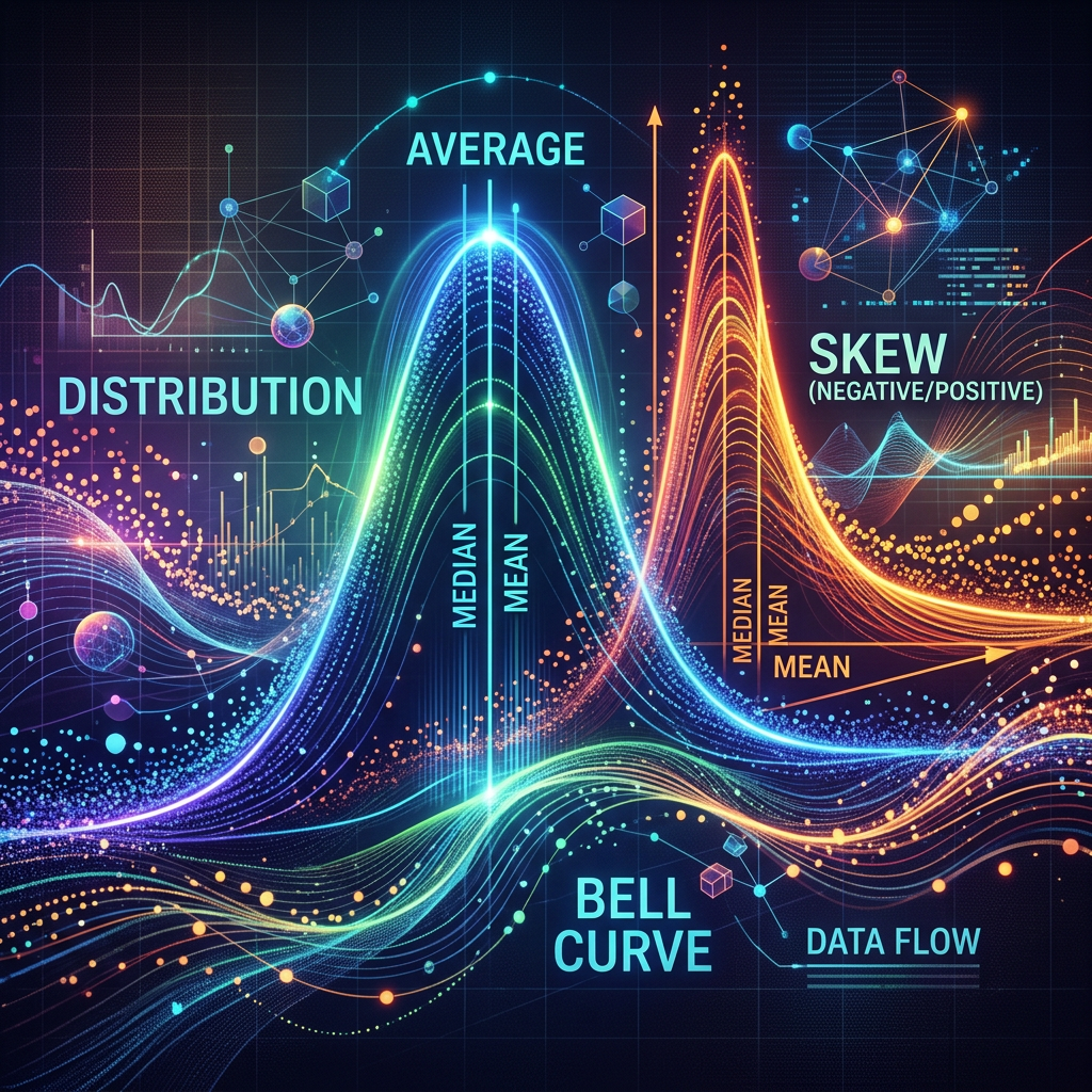
Consider skew. When a distribution has a long tail, the mean and the median separate, and the mean is dragged toward the tail. Report the average income, the average wait time, or the average cost, and a handful of large values pull the number well above what most people actually experience. The word average then overstates the typical case, and a reader who pictures a person in the middle is picturing someone who does not exist. For a skewed quantity the median is usually the more honest one-number summary.
Even the median cannot rescue a distribution with two humps. If a program helps a younger group substantially and an older group not at all, the average sits in the empty valley between them and describes neither. The average of scalding and freezing is not comfortable. Whenever a single summary lands where few of the actual observations are, it is concealing the very structure that matters.
There is a subtler trap in acting on averages rather than merely reporting them. Feeding average inputs into a plan does not produce the average outcome, a fact sometimes called the flaw of averages. Sam Savage put it that plans based on average assumptions are wrong on average, and the old joke is the statistician who drowned wading across a river that was, on average, three feet deep. When demand, staffing, or arrival times vary, a plan built on their averages will miss, and usually in the costly direction.
The same collapse hides inside evaluation. An average treatment effect near zero can mean a program did nothing, or it can mean it helped some people and harmed others who cancel out in the mean. Working on average is not the same as working, and it is a long way from working for everyone, since the average can hide the very subgroup a program is failing. That is a reason to design for heterogeneity in advance; however, it is not license to fish for flattering subgroups after the results are in, which manufactures false patterns of its own.
The discipline is to refuse to let one number stand in for a distribution. Show the shape, a histogram, the spread, a few key percentiles, not the mean alone. Choose the summary that fits the decision: the median for a typical skewed value, the tail for a risk, the range for a plan. Put variation next to the center every time. And when you act, remember you are acting on a distribution, so stress-test the plan against the spread rather than the midpoint. Daniels’s Air Force did not find a better average; it built a cockpit that fit the range.
So here is my question. When you report or plan on an average, do you know the shape of the distribution underneath it, and whether the number you are quoting describes anyone at all?


Leave a Reply