Stephen T’s Blog Spot

A blog aimed at issues only data scientists, data analysts, statisticians, evaluators, and researchers care about.

  • You survey 1,500 people, and the sample size feels like a source of strength. Big N, tight confidence intervals, precise estimates. But suppose those 1,500 were not drawn independently from the population. They were reached by first selecting 60 neighborhoods and then interviewing 25 people in each. That single fact can quietly cut the real precision of your survey by more than half, and if you do not account for it, every standard error you report will be too small.

    The reason is that people in the same cluster resemble each other. Households in a neighborhood share income levels, local conditions, and exposure to the same services. Students in a school share teachers and a common environment. Patients in a clinic share a provider and a protocol. Because the members of a cluster are more alike than two people picked at random from the whole population, each additional person you interview within a cluster tells you less that is genuinely new. You are, in part, hearing the same thing again.

    Statisticians measure this similarity with the intraclass correlation, the share of the total variation that lies between clusters rather than within them. When that correlation is zero, clustering costs you nothing and your sample behaves like an independent one. When it is above zero, which it almost always is, the information in your data is less than the row count suggests. The tool that captures the damage is the design effect, and its logic is simple: the larger your clusters and the more alike people are within them, the more precision you lose compared to a truly random sample.

    The numbers are more sobering than most people expect, because even weak within-cluster similarity adds up over large clusters. Take that survey of 1,500 people in 60 clusters of 25, and suppose the intraclass correlation is a modest 5 percent. The design effect works out to about 2.2, which means your effective sample size, the number of independent observations your data is really worth, is closer to 680 than to 1,500. You paid for 1,500 interviews and bought the precision of fewer than 700.

    Now the practical danger comes into focus. If you analyze clustered data as though every observation were independent, you are dividing by the wrong sample size. Your standard errors come out too small, your confidence intervals too narrow, and your p-values too impressive. You will report precision you did not earn, and you will call differences significant that a proper analysis would leave in doubt. This is the same false-certainty problem this series has kept circling, arriving now from the sampling side rather than the significance side.

    The fix is not to avoid clustering, which is often unavoidable and sometimes the only affordable way to collect data. The fix is to analyze the data the way it was collected. Design-based survey methods, cluster-robust standard errors, and multilevel models all exist to give clustered data honest uncertainty. And at the planning stage the design effect runs the other way: if you know you will cluster, you inflate your target sample size in advance to buy back the precision you are about to lose.

    For those of us working with federal survey data and multisite program data, this is not a corner case. It is the normal structure of the work. People are sampled within schools, counties, facilities, and program sites, and the data arrive looking flat, one row per person, with the clustering invisible unless you know to look. Reporting a confident national estimate from clustered data analyzed as a simple random sample is one of the most common ways a rigorous-looking study overstates what it knows.

    So here is my question. When you report the precision of an estimate from clustered data, do you count every row as an independent piece of information, or do you ask how many independent observations you truly have?

  • Much of this series has been about establishing cause by comparison. You find a control group, a counterfactual, a similar case that did not get the treatment, and you reason from the difference. But a great deal of real evaluation offers no such luxury. There is one program, in one place, and no comparison to be had. The instinct is to retreat to storytelling, to describe what happened and call it a narrative rather than a finding. There is a more disciplined option, and it comes from an unlikely source: detective work.

    The method is called process tracing, and its logic is the logic of a good investigator. A causal explanation is not just a claim that A produced B. It is a claim about a mechanism, a chain of events that had to occur, in order, for A to produce B. If that mechanism really operated, it would have left traces: documents, sequences, testimony, intermediate steps that must be present if the story is true. Process tracing is the disciplined search for those traces within a single case. You do not compare the case to another. You interrogate the case against what your explanation requires to be true.

    What keeps this from being mere storytelling is that not all evidence counts equally, and process tracing is explicit about why. It sorts evidence by how much it can actually do, using four kinds of test. A hoop test is a necessary condition: failing it eliminates the explanation, though passing proves little on its own. An alibi is the classic example, if the suspect was elsewhere, the case collapses. A smoking-gun test is the mirror image: passing it strongly confirms, though failing does not eliminate, like a weapon found in a suspect’s hand. Weakest are straw-in-the-wind tests, merely suggestive either way; rarest are doubly decisive tests, which confirm one explanation and eliminate its rivals at once.

    The engine underneath is Bayesian, even when no numbers appear. What gives a clue its force is not how dramatic it is, but how much more likely it would be if your explanation were true than if a rival were. A fact that any explanation would predict tells you almost nothing. A fact that only your explanation would predict is powerful, precisely because a competitor cannot easily account for it. This is why a single well-chosen observation can outweigh a pile of ordinary ones. Quality of evidence, not quantity, carries the inference. The dog that did not bark mattered to Sherlock Holmes because silence was expected under exactly one story and surprising under the rest.

    For evaluation, this reframes what a single-case study can do. Instead of asking whether the outcome appeared after the program, which almost any account would predict, you lay out the causal chain your theory of change requires, then hunt for the steps that must exist if the program truly caused the result. Just as important, you look for the evidence that rival explanations would leave if they were the real cause: a funding change, a national trend, a parallel initiative. You test both. Contribution is established not by comparison but by surviving the search for disconfirmation, a theme this series keeps returning to.

    None of this makes process tracing easy or foolproof. It demands a well-specified theory, genuine effort to imagine rival explanations rather than only your favored one, and honesty about which tests the evidence actually passed. Doubly decisive evidence is rare, and most conclusions rest on an accumulation of hoop and smoking-gun tests. But done well, it lets you say something disciplined and defensible about causation in exactly the situations where a comparison group was never available, which is much of the work.

    So here is my question. When you have only a single case and no comparison, do you retreat to narrative, or do you specify the fingerprints your explanation must have left and go looking for them?

  • The Case Against P-Values: Rethinking Statistical Significance

    Over the course of this series I have returned, from several directions, to the same issue. This may be due to a bias that I picked up when I worked at ECRI writing systematic reviews for AHRQ’s Evidence Based Practice Center program. I read an article, authored by Sander Greenland and colleagues, on the worth of the p-value.

    P-hacking, where enough analytic choices will eventually produce a significant one. Publication bias, where the literature keeps the significant findings and buries the rest. The gap between an effect that clears a threshold and an effect that matters. And most recently, the discovery that a significant result from an underpowered study is probably exaggerated and might have the wrong sign. Each post attacked a different failure. Taken together they raise a fair question. If the p-value causes this much trouble, what would we do without it?

    Start with what a p-value actually is, since much of the trouble begins here. It is the probability of observing data at least as extreme as yours, assuming the null hypothesis and every other assumption in your model are true. That is all. It is not the probability that the null hypothesis is true. It is not the probability your result was a fluke. It does not tell you whether an effect is large, important, or real. The American Statistical Association said as much in its 2016 statement, which was less a critique of the p-value than a catalogue of what people mistakenly believe about it.

    Notice that none of my earlier posts actually indicted the p-value itself. They indicted the threshold. The damage comes from dichotomizing a continuous measure of compatibility into significant and not significant, and then treating that binary as a verdict about reality. The threshold is what makes p-hacking worth doing, what tells journals which results to publish, and what filters an underpowered study’s estimates so that only the exaggerated ones survive. The number is a symptom. The line drawn through it is the disease.

    The field has taken this seriously. In 2019 the American Statistical Association devoted an entire special issue to a world beyond the 0.05 threshold, and in the same year a comment in Nature by Valentin Amrhein, Sander Greenland, and Blake McShane, endorsed by more than 800 signatories, called for retiring statistical significance. It is worth reading what they actually proposed, because it is more careful than the headlines suggested. They did not call for banning p-values. They called for ending the practice of using them to sort results into two bins, and for treating a p-value as one piece of evidence among many.

    We even have a natural experiment. In 2015 the journal Basic and Applied Social Psychology banned null hypothesis significance testing outright, requiring authors to strip p-values, test statistics, and claims about significance before publication. Later assessments of what followed are instructive. Removing the tests did not by itself produce better inference. Authors leaned on descriptive statistics, and without any formal way to express uncertainty, some simply asserted conclusions that the data did not compel. Taking away the crutch does not teach anyone to walk. It can just leave the argument unsupported.

    So what fills the space? Not one replacement, which is precisely the point. Report the effect size and an interval around it, and interpret the whole interval rather than checking whether it crosses zero, since the values near its edges are compatible with your data too. Ask what effect size is plausible before you run the study, and what your design would do with it, which is design analysis. State how strong an unmeasured confounder would have to be to overturn your conclusion, which is sensitivity analysis. Bring in prior evidence explicitly, which is what Bayesian methods make natural. And replicate, because a single study, whatever its p-value, was never meant to settle anything.

    A world without p-values, then, is not one where the number disappears. It is one where the number stops making decisions. Where a result is described rather than adjudicated, where uncertainty is stated rather than dissolved by a threshold, and where judgment is expected rather than outsourced to a convention. The American Statistical Association’s own summary of this posture is admirably plain: accept uncertainty, and be thoughtful, open, and modest.

    That is harder than reading off a threshold, which is exactly why the threshold has survived. A p-value below a line gives a decision-maker something a nuanced interval cannot: permission to stop thinking. Our job, when we hand over findings, is to make the honest version easier to act on than the false certainty it replaces.

    So here is my question. If you could not report statistical significance at all, only your estimate, your uncertainty, and your assumptions, would your conclusions change, and would your reader be better served?

  • Why Small Studies Can Mislead Research Findings

    An underpowered study is usually described as one that might miss a real effect. That is true, and it is the least of the problem. The deeper danger is what happens when a small, noisy study does find something. A statistically significant result from an underpowered study is probably a large overestimate of the true effect, and it has a meaningful chance of pointing in the wrong direction entirely.

    The logic is worth walking through slowly, because it is not obvious. Suppose the true effect is real but modest, and your study is small or your measurements are noisy. Your estimate will bounce around the truth from sample to sample, sometimes landing near it, sometimes far. Now impose the significance filter. To clear the threshold, an estimate has to be far from zero. The estimates near the true, modest value do not make it. Only the ones that happened to land far out do. Significance therefore selects, systematically, for the exaggerated draws. The finding is not significant despite being extreme. It is significant because it is extreme.

    Andrew Gelman and John Carlin gave these failures names in 2014, and the names are useful. Type M error, the exaggeration ratio, is the factor by which a significant estimate overstates the true effect on average. Type S error is the probability that a significant estimate carries the wrong sign, that you conclude the program helped when it actually harmed, or the reverse. Neither of these is captured by the familiar Type I and Type II errors, which speak only to whether an effect was detected, not to whether the number you report bears any resemblance to reality.

    The magnitudes involved are sobering. In one published example, Gelman and Carlin analyzed a study whose design gave it roughly 6 percent power. At that level, a significant result would be expected to overstate the true effect by a factor of nearly ten, and would have about a one-in-four chance of having the wrong sign. Read that again. A quarter of the significant findings from such a design would point in the opposite direction from the truth, and the rest would be wildly inflated. The study passed the significance test, and the number it reported was close to meaningless.

    This reframes a lot of familiar advice. Statistical power is usually presented as insurance against missing an effect, so a small study is treated as a modest, cautious thing that simply proves less. It is worse than that. An underpowered study that reports nothing has cost you an answer. An underpowered study that reports something has handed you a number that is probably too large and possibly backwards, wrapped in the authority of statistical significance. This is why the literature is littered with dramatic effects that shrink or vanish on replication. They were never that big. The filter selected the flukes.

    So what do you do? Gelman and Carlin’s answer is design analysis. Before you run a study, and even after, ask what effect size is actually plausible given what is known, and then work out what your design would produce if that plausible effect were true. How much would a significant estimate be expected to exaggerate it? What is the chance of a wrong-sign result? Doing this requires an honest, externally informed guess about the effect, which is the hard part, and doing it prospectively is what tells you whether the study is worth running at all. A design that would only ever yield a wildly exaggerated estimate is not a cautious study. It is a machine for producing confident nonsense.

    For those of us evaluating programs, the practical rule is simple. Do not treat a significant finding from a small pilot or an underpowered evaluation as a conservative estimate of the effect. Treat it as an upper bound at best, and be prepared for the true effect to be far smaller or the reverse of what you found. Ask what effect size the design could plausibly have detected. If the answer is much larger than anything the program could realistically produce, the study cannot tell you what you want to know, whatever the p-value says.

    So here is my question. When a small study reports a significant effect, do you treat that number as your best estimate of the truth, or as the exaggerated survivor of a filter that only lets the extreme results through?

  • Evaluating Data Fitness: Six Key Questions

    In my previous post from earlier today I argued that data is never good in the abstract, only fit or unfit for a particular use. That leaves the practical question. Given a dataset and a purpose, how do you actually decide whether the first can serve the second? The answer is not a feeling about data quality. It is an interrogation, and these are the six questions I would ask in order.

    1. What was this built to do? Establish provenance before anything else: who created the data, for what operational purpose, under what incentives, and what has happened to it since. That history, the lineage, tells you where the definitions came from and what pressures shaped them. A field that triggers a payment is recorded with great care. A field that no one uses is filled in casually. You cannot judge fitness without the biography.

    2. Does the variable mean what my construct means? Take each variable you plan to lean on and write down the definition your question requires, then find the definition the system actually uses. Compare them explicitly. Served, active, completed, and eligible all have operational meanings that rarely match research constructs. The gap between the recorded field and the intended concept is where analyses quietly go wrong.

    3. Who is in this data, and who could never be? Coverage decides what population your findings can describe. An administrative system contains the people it touched, which excludes those who never applied, were screened out, or dropped away before the record was created. Ask what the denominator really is. If the people missing from the frame differ systematically from the people in it, no amount of analysis on the records you have will tell you about the ones you do not.

    4. Why are the values missing? Missingness in operational data is rarely random. Fields go blank because a workflow branched, a requirement did not apply, or a caseworker was busy. That mechanism matters more than the missingness rate, because it determines whether the gaps are ignorable or a source of bias, a point this series has made before. A dataset that is 5 percent missing for a reason related to your outcome is more dangerous than one that is 30 percent missing at random.

    5. Is it timely enough for the decision it must inform? Data has a shelf life set by the question. Check when the data was collected, how long the lag runs, and whether the definitions or systems changed midstream. A break in a trend is often a form redesign or a policy change rather than a change in the world. And an answer that arrives after the decision has been made is not fit for that use, however accurate it is.

    6. Can I write this down so someone else can check it? Document what you learned: the source, the operational purpose, the definitions, the coverage, the missingness mechanism, the known limits, and the uses the data can and cannot support. The field has converged on this idea in the form of the dataset datasheet, which records a dataset’s motivation, composition, collection process, and recommended uses. If you cannot produce that record, you do not yet know your data well enough to defend a finding drawn from it.

    Two things stand out about this list. First, fitness for use is a verdict about a pairing, this data for that question, so it must be reassessed whenever either changes. Data blessed as fit for a performance report is not thereby fit for an impact evaluation. Second, none of these questions requires advanced statistics. They require curiosity and a willingness to ask uncomfortable things about a convenient dataset before it becomes the foundation of a finding. That is what data governance means in practice for a researcher: not a compliance exercise, but knowing your data well enough to say what it can honestly support.

    So here is my question. Could you write a page documenting the provenance, definitions, coverage, and limits of the dataset your current analysis depends on, and if not, what would it change to find out?

  • Is Your Dataset Fit for Purpose?

    A dataset lands on your desk, large and clean, and someone asks the natural question: is it good? That question has no answer as posed. Data is not good or bad in the abstract. It is fit, or unfit, for a particular use. The same dataset can be excellent for one question and worthless, even misleading, for another. Quality is not a property of the data. It is a relationship between the data and the purpose you bring to it.

    This is not a personal opinion; it is the settled definition in the field. Data quality is standardly defined as fitness for use, quality judged by the data consumer and the task at hand. And it has two very different faces. There are the intrinsic virtues everyone thinks to check, accuracy, completeness, consistency, currency. And there are the contextual ones that actually decide whether the data can answer your question: relevance to what you are asking, coverage of the right population, capture of your construct, timeliness for your decision. A dataset can pass every intrinsic test and fail the contextual ones completely. Accurate is not the same as useful.

    The clearest way to see this is with the kind of data we are increasingly handed. Robert Groves, a former director of the Census Bureau, drew a useful line between designed data, gathered deliberately to answer a question, and organic data, the exhaust of transactions and operations: case files, billing records, eligibility systems, service logs. Organic data accumulates whether or not anyone intends to analyze it. Most of what now arrives on our desks is organic: a found object, not a designed instrument, built to run a program, not to evaluate one.

    That origin is exactly where the trouble hides, because the categories in operational data encode operational needs, not research constructs. A label like served might mean a case was opened, not that a person received help. A field gets filled in when it triggers a payment and left blank when it does not, so the missing values follow the workflow rather than chance. The population is everyone the system happened to touch, which quietly excludes everyone who never entered it, often the very group you need to see. Definitions drift as policies and software change, so a sharp trend can be the fingerprint of a form redesign rather than a change in the world. None of these show up in an accuracy check. The data can be flawless about the wrong thing.

    Underneath all of it is a familiar idea in new clothing. Whether a dataset fits your use is really a question about the gap between what the data actually records and what you are trying to learn, which is a matter of construct validity, a theme this series has visited before. Having the data is not the same as being able to answer the question, and treating the two as interchangeable is one of the quietest ways an analysis goes wrong, because it goes wrong before a single number is computed.

    For those of us in federal research and evaluation, the pull toward found data is strong and often sensible. It is cheaper, faster, and already sitting there, and agencies increasingly expect us to use it rather than field something new. But the convenience conceals the risk. When a program office says to just use the administrative data, the honest first move is not to run the analysis. It is to interrogate the data: what was this built to do, and does that match what we need it to tell us? Reaching for the data that happens to be available, rather than the data the question requires, is the streetlight problem in a modern form.

    Deciding whether a dataset is actually fit for your purpose is a skill, not a hunch, and it can be done systematically. That is where the next post will go. For now, the shift in mindset is the whole point. Stop asking whether the data is good, and start asking what it is good for.

    So here is my question. When a convenient dataset arrives, do you first ask what it was built to do and whether that matches your question, or does its size and cleanliness stand in for fitness?

  • The Shortcut in Every Survey

    A survey question asks a lot more than it appears to. To answer well, a respondent has to interpret what you meant, search memory for the relevant information, weigh it into a judgment, and then map that judgment onto the response options you offered. That is real cognitive work, and we assume that respondents are willing to do all of it, on every question, to the end of the questionnaire. Often they are not. And when they are not, they will look to take a shortcut.

    The name for that shortcut is satisficing, a term the survey methodologist Jon Krosnick brought into this field in 1991. Instead of doing the full work to produce the best answer, the optimal answer, the respondent settles for one that is merely good enough to seem reasonable. They are not lying, and usually not careless in any dramatic way. They are conserving effort, exactly as people do on any demanding task, and the survey quietly absorbs the cost in the form of worse data.

    It shows up in familiar patterns, once you know to look. A satisficing respondent tends to agree with whatever a question asserts, a habit called acquiescence. They pick the first response option that sounds acceptable rather than reading to the end of the list. On a long grid of rating items, they choose one column and run straight down it, a pattern called straightlining or nondifferentiation. They reach for the midpoint, or they say they do not know when they actually hold a view. Each of these is a plausible-looking answer produced with very little of the thinking the question was designed to capture.

    Krosnick’s real insight was in explaining when this happens. Satisficing is not a character flaw in your sample. It is the predictable product of three things: how hard the task is, how able the respondent is, and how motivated they are. Make the question harder, or the respondent more tired, distracted, or indifferent, and the shortcut becomes more tempting. That means satisficing is partly under your control, because you built the task. A confusing item, a fatiguing grid, a questionnaire that runs too long, each one raises the price of a good answer.

    There is a trap here that deserves its own warning. Satisficing can make your data look better while making it worse. When respondents straightline a battery of items, their answers become highly consistent, and internal-consistency reliability, the statistic many take as a sign of a good scale, goes up. But that consistency is an artifact of the shortcut, not evidence that the items measured anything well. It is a reminder of an earlier post in this series: reliability is not validity, and a number that rises for the wrong reason is worse than no number at all.

    The encouraging part is that the same three levers can reduce it. Lower the task difficulty with simpler, clearer items, shorter grids, and an instrument no longer than the purpose requires. Support motivation by explaining why the survey matters and respecting the respondent’s time. And design out the easy escapes: think twice before offering a blanket no-opinion option that invites people to skip the work, and vary the order of response options so primacy does not do the answering. You cannot force optimizing, but you can lower the cost of it.

    For those of us who collect survey data for federal clients, this is not a fine point. The estimates we deliver, and the decisions built on them, assume the answers reflect what respondents actually think and do. Satisficing quietly breaks that assumption, and it does so most where burden is highest and interest is lowest, which is often exactly the population a program most needs to hear from. Treating response quality as something we design for, rather than assume, is part of the craft.

    So here is my question. When you build an instrument, do you design it to make a careful answer easy to give, or do you unintentionally reward the respondent for taking the shortcut?

  • Effective Cost Analysis: Avoiding Common Pitfalls

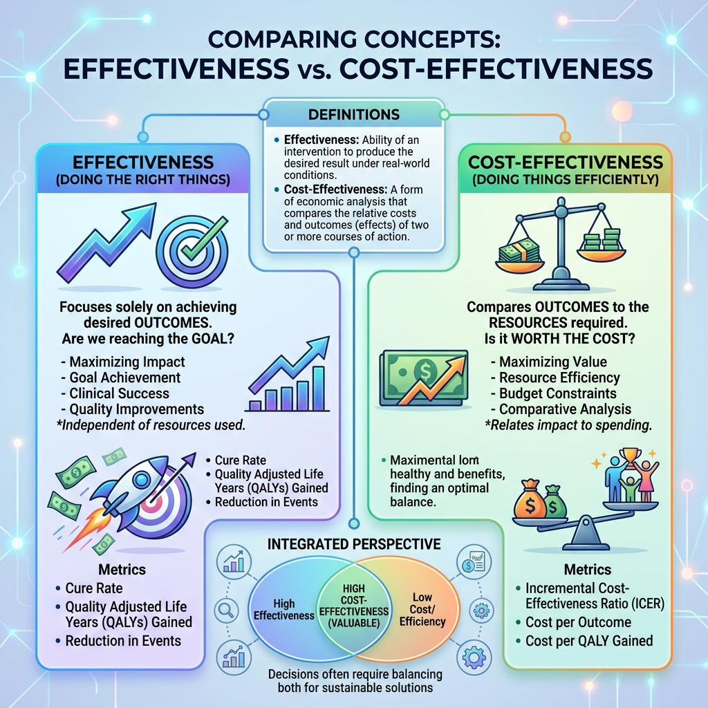
    In a previous post I argued that effectiveness is only half the question, and that a program can work and still be a poor use of money. That raises the obvious follow-up: how do you actually build a cost-effectiveness case that will survive scrutiny? The good news is that most of it is not exotic math. It is disciplined bookkeeping and honesty about assumptions. Here are the steps that matter.

    1. Fix the perspective first. Decide whose costs and benefits count: the funding agency alone, or society more broadly? This single choice governs the entire ledger, because participant time, volunteer labor, and costs pushed onto other systems are in or out depending on it. Most arguments about a cost-effectiveness result are really arguments about perspective, so state yours plainly and up front.

    2. Choose the comparator honestly. The result is incremental, so it depends entirely on the alternative you measure against. Compare the program to the realistic next-best option, not to doing nothing and not to a straw man. The comparator often decides the verdict, which is exactly why it deserves to be chosen in the open rather than chosen to flatter the program.

    3. Count all the costs, not just the visible ones. The program budget is not the cost. List every resource the program actually consumes, staff, space, and materials, and then the easily forgotten ones: participants’ time, donated facilities, administrative burden, and costs shifted onto other agencies. Value each at what it would otherwise be worth. This ingredients approach is tedious, and it is where most weak analyses fall apart.

    4. Put future costs and benefits in present-value terms. A dollar spent or a benefit received years from now is not worth the same as one today, so you discount future flows back to the present. This matters most for programs whose payoffs arrive late, such as prevention or early education, because the discount rate quietly shrinks distant benefits. For federal work the rate is not yours to invent: OMB Circular A-94, revised in 2023, sets the discount rates, tied to Treasury rates and updated annually. Use the prescribed rate and state it.

    5. Express the result as an incremental ratio, and compare it to something. Report the extra cost per additional unit of outcome relative to your comparator, then set it against a meaningful benchmark: a threshold, a competing program, or the other uses bidding for the same money. A ratio floating on its own is not yet a decision. The point of the number is the comparison.

    6. Stress-test every load-bearing assumption. The result rests on uncertain inputs, the effect size, the unit costs, the discount rate, and how long the benefits last. Vary them and watch what happens. One-way sensitivity analysis moves one input at a time; a probabilistic version varies them together to show how often the program still comes out ahead. If the conclusion flips under plausible values, that is the finding, and you report it.

    Notice that none of these steps is really about arithmetic. They are about candor: declaring the perspective, choosing a fair comparator, counting the costs no one likes to count, discounting honestly, and showing the assumptions rather than burying them. A cost-effectiveness case earns its authority the same way any good analysis does, by making every consequential choice visible enough for a skeptical reader to check. The last step in particular is the same discipline this series has returned to before. A result you have not stress-tested is a result you do not yet understand.

    So here is my question. When you make a value-for-money case, do you declare your perspective and comparator and show how the answer moves as the assumptions change, or does a single tidy ratio carry the whole argument?

  • Maximizing Value: Cost vs Effectiveness

    An evaluation comes back positive. The program works, the effect is real, and the instinct is to call it a success and recommend expanding it. But whether it works is only half of the question a decision-maker actually faces. The other half is whether it is worth it, and a program can clear the first bar and fail the second.

    The reason is simple and unforgiving. Resources are finite, so every dollar spent on this program is a dollar not spent on something else. That makes the useful question not merely whether the program produces an effect, but how much effect it produces per dollar, and whether that rate beats the alternatives you could have funded instead. Effectiveness without cost is half an answer. A program that works but costs a fortune to move the needle a little may be a worse use of public money than a cheaper one that works less well.

    There are two main ways to bring cost into the picture. Cost-effectiveness analysis expresses the result as cost per unit of outcome: dollars per additional graduate, per case prevented, per job placement, per healthy year gained. Because the outcome stays in its natural units, you can compare programs that share a goal. Cost-benefit analysis goes a step further and puts a dollar value on the outcomes themselves, so benefits and costs are measured in the same units and you can ask whether the benefits exceed the costs outright. Cost-benefit is more ambitious and more contestable, because assigning a dollar figure to a year of schooling or a life saved requires assumptions many people will dispute.

    Two ideas do most of the real work. The first is that the comparison must be incremental. What matters is the extra cost and the extra effect relative to the next-best alternative, not relative to doing nothing. The same program can look like a bargain against no action and a poor deal against the cheaper option already available, so the honest analysis uses the right comparator. The second is opportunity cost: the true cost of a choice is the best thing you gave up to make it. Money spent here is benefits foregone elsewhere, and a program that looks affordable on its own can be expensive once you count what the same funds would have bought.

    None of this is as clean in practice as it sounds, and the traps deserve naming. A cost-effectiveness number is only as good as the costs you remember to count. It is easy to tally the visible program budget and omit the participants’ time, the administrative burden, or costs shifted onto other systems, and the answer moves with the perspective you take. It is easy to credit the program with benefits really produced by something else, which is the causal-inference problem the rest of this series wrestles with. And a single ratio can hide who pays and who gains, a question of fairness that efficiency alone does not answer. The number informs judgment; it does not replace it.

    One confusion is worth killing directly. Cost-effective does not mean cheap. The cheapest program is not the most cost-effective if it accomplishes little, and the most expensive can be the best value if it accomplishes a great deal. Cost-effectiveness is a ratio of outcome to cost, not a price tag, and the lowest sticker price and the best value for money are often not the same choice.

    For those of us who work in and around federal programs, this is close to daily life. Public budgets are effectively zero-sum in the short run, and agencies are increasingly asked to show value for money, not just an effect. An evaluation that reports an impact but says nothing about cost hands the decision-maker half a picture. And in a business case or a proposal, the value-for-money argument is often what separates a fundable idea from a merely interesting one. Bringing cost in, and bringing it in honestly, is part of the work.

    So here is my question for the group. When you judge whether a program should grow, do you ask what its results cost and what the same money could have bought elsewhere, or does a positive effect settle the matter on its own?

  • Understanding Overfitting in Predictive Modeling

    You build a model and it fits beautifully. The line threads through nearly every point, the R-squared is high, and each bump in the data is captured. It feels like success. Very often it is the opposite. A model that fits the data in front of you more closely can predict new data worse, and the tighter that in-sample fit, the more suspicious you should be.

    The culprit is overfitting. Any real dataset is a mix of signal, the true underlying pattern you care about, and noise, the random quirks specific to this particular sample. A flexible enough model will happily fit both. But the noise will not repeat in the next sample, so fitting it does not just fail to help, it actively hurts. Add enough parameters and you can drive the error on your data to zero, fitting every wrinkle. At that point the model has not learned the pattern. It has memorized the sample, and it will fall apart on data it has not seen.

    Behind this sits a tradeoff worth naming. A model that is too simple misses real structure and is wrong in a consistent way; statisticians call that bias. A model that is too complex chases the noise and swings wildly from sample to sample; that is variance. Push complexity down and bias grows; push it up and variance grows. Good modeling lives in the balance, flexible enough to catch the signal, disciplined enough to ignore the noise. Complexity is never free, and more of it is not better.

    The practical consequence is the important part. Because in-sample fit is inflated by exactly this problem, you cannot judge a predictive model on the data used to build it. The fit statistic there is close to a vanity metric. The only honest test is how the model performs on data it has never seen. So you hold out a portion of the data, build the model on the rest, and check it against the untouched part. Or you use cross-validation, training repeatedly on most of the data and testing on the piece left out, then averaging for a steadier estimate. Out-of-sample performance is the number that speaks to the future.

    This is really the prediction cousin of two ideas this series has already visited. A model tuned to fit one sample perfectly is close kin to a result that only appears because someone tried enough specifications until something clicked. Both mistake the quirks of a particular sample for a general truth. And a very large dataset is no protection if you let the model grow more complex as the data grows, because a big enough model can memorize a big enough sample just as easily.

    There is a subtle way the discipline fails even when people mean well. The held-out test is only honest if it stays untouched. If you check it, adjust the model, check it again, and repeat, the test set quietly becomes part of the training, and your out-of-sample estimate is no longer out of sample. The safeguard is to keep a genuinely sealed holdout for one final look, and to resist the urge to peek.

    For those of us in research and evaluation, this matters more every year, because predictive models are spreading through the work: risk scores, targeting and needs models, and machine-learning tools sold as decision aids. When a vendor or a colleague reports how accurate a model is, the first question is simple. Accurate on what data? If the number comes from the same data the model was trained on, it tells you almost nothing about how the tool will behave in the field. Ask for out-of-sample performance, ideally on a different time period or site, which is the external-validity question wearing new clothes.

    So here is my question. When you judge a model, do you insist on seeing how it performs on data it was never allowed to learn from, or does a beautiful fit on the training data quietly do the convincing?

  • Lessons from the Declaration of Independence for Modern Researchers

    A departure today, in honor of the July 4th holiday. This is not a methods post in the usual sense, but it circles back to something this series cares about a great deal, so I hope you will indulge the detour.

    It is a fitting day to look a scholarly at the Declaration of Independence. What is most striking about it is not the soaring language everyone remembers, but something quieter and, to my eye, more remarkable. The Declaration is an argument, and a strikingly disciplined one. Before it makes its case, it tells you what kind of case it intends to make.

    Very early, it sets a standard for itself. It says that when a people take a step this consequential, “a decent respect to the opinions of mankind requires that they should declare the causes.” In other words, it is not enough to assert that separation is justified. You owe the world your reasons. That is a promise about evidence, made before any evidence is offered.

    And then the document keeps the promise. It arrives at a line that ought to be dear to anyone who works with data: “let Facts be submitted to a candid world.” What follows is not more rhetoric. It is a list, a long bill of particulars, grievance after grievance, laid out plainly so that a reader could examine each one and judge for themselves. The argument does not ask to be believed. It hands over the record and invites scrutiny.

    That is the whole ethic of evidence-based work, written in 1776. A conclusion, however confident, is not enough on its own. You owe your audience the facts that led you there, arranged so they can weigh them, question them, and if warranted, disagree. The authority of a claim does not come from the force with which it is stated. It comes from a willingness to submit it to a candid world, to readers who do not already agree and who are free to check.

    This is the thread running through much of what I write here. Show your reasoning. Make your evidence auditable. Go looking for the case that does not fit. Trust the reader to judge rather than demanding assent. It is fitting, I think, that the principal author of the Declaration, Thomas Jefferson, was himself a relentless collector of facts, a man who filled notebooks with weather readings, measurements, and records of nearly everything he encountered. The same habit of mind that gathers evidence is the one that insists on laying it before others.

    Those of us who do research and evaluation for public institutions inherit that clause in a small and practical way. Our task, at its best, is to submit facts to a candid world: to give decision-makers and citizens the honest evidence, arranged clearly, and then to respect them enough to let them draw the conclusions. The candid world is our client, and it deserves the facts, not just the verdict.

    So here is my question. When you present your findings, do you submit the facts and invite the reader to judge, or do you ask them to trust the conclusion and move on?

  • Understanding the Planning Fallacy in Project Management

    Ask an experienced team how long a project will take, and they will study the specifics. They will break the work into phases, estimate each one, add the pieces, and perhaps pad the total for safety. It is a careful, disciplined process, and it produces an answer that is almost always too optimistic. The very act of building the estimate from the inside is what biases it.

    This is the planning fallacy, named by Daniel Kahneman and Amos Tversky in 1979. It is the systematic tendency to underestimate the time, cost, and risk of a plan while overestimating its benefits, and its most unsettling feature is that experience does not cure it. People who have watched similar projects run late will still forecast that this one will finish on schedule. The classic demonstration followed students estimating when they would finish their theses; most blew past even their own worst-case predictions, and the pattern holds far beyond students.

    The root of the problem is the view you take. When you plan from the inside, you focus on the particulars of this project: your team, your approach, the steps you intend to follow. That view feels rich and relevant, and it is exactly the view that misleads, because it cannot show you what you do not know to look for. The delays that wreck projects are rarely the ones on anyone’s list: the vendor who fell through, the requirement that changed, the clearance that took four months. The inside view has no slot for the unexpected, which is precisely why the unexpected keeps winning.

    The alternative is the outside view. Instead of asking how this project will unfold step by step, you ask a different question: how did similar projects actually turn out? You assemble a reference class of past efforts that resemble this one, you look at what they really cost and how long they really took, and you start your estimate from that distribution rather than from your own plan. Your project is not as unique as it feels from the inside, and the track record of its cousins is the best predictor you have.

    This is the heart of reference class forecasting, developed by Bent Flyvbjerg from that original insight. Study large infrastructure projects and the numbers are sobering: in one well-known analysis, the large majority of rail projects overshot their cost estimates, by an average of nearly 30 percent. Reference class forecasting starts from that empirical reality and adjusts for the case at hand, rather than the reverse. The approach is now written into official guidance, including the United Kingdom Treasury’s rules for appraising major public spending. Kahneman called taking the outside view the single most valuable thing you can do to improve a forecast.

    It is not a cure-all, and it is fair to say so. A useful reference class can be hard to define when a project really is novel, and reasonable people can argue about which past efforts belong in it. The method also corrects the symptom, the optimism, more than it explains the specific causes. But none of that undoes the core point. An estimate anchored to how comparable work actually turned out beats one built purely from the hopeful logic of your own plan.

    There is one more force worth naming, because it lives in my corner of the world. Optimistic estimates are not only a cognitive error; they are often rewarded. The confident schedule wins the bid, and the lean budget secures the approval. That pressure quietly pushes forecasts toward best-case thinking exactly when a sober number matters most. The outside view is a discipline against both the bias and the incentive, which is part of why it is hard to adopt and valuable when you do.

    So here is my question. The next time you estimate a cost or a timeline, do you start from the details of your own plan, or from the record of how similar efforts actually turned out?

  • Understanding Sensitivity Analysis in Causal Claims

    Every causal claim from observational data rests on an assumption that cannot be checked. When you estimate the effect of a program, a treatment, or a policy from data you did not randomize, you are assuming that you have measured and adjusted for every important confounder. There is no test for this. The variable that ruins your estimate is, by definition, the one you did not measure. So the honest question is not whether unmeasured confounding exists. It almost certainly does. The question is how much of it your conclusion could withstand.

    This is what sensitivity analysis is for, and it is the discipline this series keeps circling back to. Methods like propensity-score matching, regression adjustment, and difference-in-differences all do their work on the confounders you can see. None of them touches the ones you cannot. Sensitivity analysis fills that gap, not by removing the hidden bias, but by asking a sharp and answerable question: how strong would an unmeasured confounder have to be to overturn this result?

    The most accessible tool for this is the E-value, introduced by Tyler VanderWeele and Peng Ding in 2017. It answers that question with a single number. The E-value is the minimum strength of association, expressed as a risk ratio, that an unmeasured confounder would need to have with both the treatment and the outcome, above and beyond everything you already adjusted for, in order to fully explain away your finding. In plain terms: how strong would the thing you missed have to be to erase your effect?

    The interpretation is direct. A large E-value means it would take a powerful hidden confounder to undo your result, so the finding is relatively robust. A small E-value means a fairly weak confounder, the kind that could plausibly be lurking, would be enough to reduce your effect to nothing. Suppose an analysis reports an E-value of 1.3. That says a confounder associated with both treatment and outcome by only about a 1.3-fold risk ratio each would suffice to explain the whole thing away. Confounders that weak are everywhere, so the result should not impress you. An E-value of 5, by contrast, demands a hidden factor stronger than most confounders anyone can name.

    You can compute the E-value not just for the point estimate but for the limit of the confidence interval nearest the null. That version asks how much confounding it would take not to erase the effect entirely, but merely to make it statistically indistinguishable from zero. It is usually the more honest number to report, because it speaks to the boundary of the claim rather than its center.

    What makes this a discipline rather than a calculation is the next step: comparing the E-value to what you know about the setting. A number alone means little. The question is whether a confounder of the required strength is plausible given the covariates you already controlled. If you have adjusted for the obvious drivers and the E-value still demands an implausibly strong hidden factor, your causal claim has earned some confidence. If a mundane unmeasured variable could clear the bar, temper the conclusion, whatever the p-value says. That comparison is a judgment informed by subject knowledge, not something the number decides for you.

    For those of us who evaluate programs on observational data, which is most of us most of the time, this belongs in the standard toolkit. A confidence interval tells you about sampling noise. It says nothing about the larger threat, bias from what you could not measure. Reporting an effect without a sensitivity analysis shows only the risk from randomness while staying silent about the risk from confounding. The mature move is to state, in one defensible number, how strong the missing piece would have to be, and then argue honestly about whether it could be that strong.

    So here is my question. When you present a causal estimate from observational data, do you quantify how much unmeasured confounding it would take to overturn it, or do you let the confidence interval stand in for a robustness it was never designed to measure?

  • The Gap Might Be in the Instrument

    You field a survey, score it, and compare two groups. Men score higher than women on the scale, or one site outperforms another, or the average climbs after the program. The natural next move is to interpret the difference. But there is a prior question that almost no one asks, and it can dissolve the finding entirely: does the instrument measure the same thing, on the same scale, in both groups? If it does not, the gap you are admiring may live in the measure, not in the people.

    This is the problem of measurement invariance. When you compare scores across groups, you are quietly assuming the items behave the same way for everyone. The assumption can fail. When it does, you have what psychometricians call differential item functioning: two people with exactly the same true level of the trait respond differently to an item depending on which group they belong to.

    An example makes it concrete. Suppose a depression scale includes the item ‘I cry easily.’ If, at the same underlying level of depression, women are more likely to endorse that item than men because of social norms about crying rather than because of depression, then the item adds to women’s scores for a reason that has nothing to do with the construct. Compare raw totals and you will find a gender difference in depression that is partly just a difference in how one item behaves. The ruler is bent differently for the two groups, and the bend is invisible in the totals.

    This quietly threatens a huge share of routine comparisons. Across demographic groups, where items may carry different connotations. Across translations, where the Spanish and English versions of a questionnaire may not be equivalent no matter how careful the translation. Across countries, where a response scale is read differently. And across time, the most treacherous case: if a program changes how people interpret the questions, their internal yardstick moves, and that shift can masquerade as real change in the outcome.

    The discipline is to test for invariance before you compare, not after. The approach builds up in steps. Configural invariance asks whether the same basic structure holds in each group, the same items tapping the same factors. Metric invariance adds the requirement that items relate to the construct with equal strength, which lets you compare relationships across groups. Scalar invariance adds equal intercepts, the level you actually need before comparing group means honestly. Reach it, and a difference in scores can be read as a difference in the trait; fall short, and the comparison is contaminated. Multi-group factor analysis and item response models make all of this testable rather than assumed.

    None of this means a comparison is doomed the moment one item misbehaves. Partial invariance, where most items are equivalent and a few are not, is often enough to support a careful comparison once the offending items are handled. And here is the part worth holding onto: failing an invariance test is not a failure of your study. It is a finding. It tells you the construct is understood or expressed differently across the groups you care about, which is often substantively interesting in its own right. The real error is never running the test, and reporting the raw gap as though it were obviously real.

    For those of us in federal evaluation, this lands close to home. Our work is saturated with exactly the comparisons that invariance governs: across states, across demographic subgroups, across program sites, across languages, and before and after an intervention. Equity analyses and subgroup breakouts depend entirely on the instrument meaning the same thing for every group being compared. Report a disparity or a pre-post gain without checking that, and you may be reporting a property of your questionnaire rather than a fact about the world.

    So here is my question. Before you compare scores across groups or across time, do you check that the instrument means the same thing in each, or do you treat the numbers as automatically comparable?

  • Understanding the Risks and Benefits of Medical Screening

    In the previous post I argued that screening can do harm, and that the usual evidence offered for it, more cases caught and higher survival rates, is exactly the evidence that misleads. That naturally raises the next question. If survival and cases found are the wrong measures, what are the right ones? How do you tell a screening program that earns its place from one that does not? There is an actual toolkit, and it comes down to a handful of demands you should make before you believe a program works.

    Demand mortality, not survival. Survival measured from diagnosis is inflated by the lead-time and length biases described last time, so it cannot settle the question. The honest endpoint is the death rate in the whole group offered screening compared with a similar group that was not. And there is a stricter version: all-cause mortality. A program can lower deaths from the target disease while leaving total deaths unchanged, because the workup and treatment carry their own risks and the disease-specific gain is often small. This is not hypothetical. The randomized trials of breast screening have shown reductions in breast-cancer deaths, yet neither the individual trials nor the pooled analysis has demonstrated a reduction in deaths from all causes. That deserves a long pause before anyone calls a program lifesaving.

    Insist on absolute risk, not relative risk. A claim that screening cuts deaths from a cancer by 20 percent sounds overwhelming, but 20 percent off a small baseline risk is a small number, and the relative figure is built to hide that. The Cochrane review of mammography put the benefit at roughly a 15 percent reduction in breast-cancer death in relative terms, which works out to about 0.05 percent in absolute terms. Both numbers describe the same trials. One feels decisive; the other tells you what a given woman should actually expect. Always ask for the absolute number.

    Translate the benefit into number needed to screen, and put the harms in the next column. Number needed to screen asks the plain question: how many people must be screened, for how long, to prevent one death? For breast cancer, decision models suggest that screening 1,000 women in their forties every other year over their lifetimes prevents on the order of 8 breast-cancer deaths, at a cost of roughly 1,500 false alarms, around 200 unnecessary biopsies, and about 20 overdiagnosed cancers, every one of which is then treated. State only the first column and you are advertising. State both and you are evaluating.

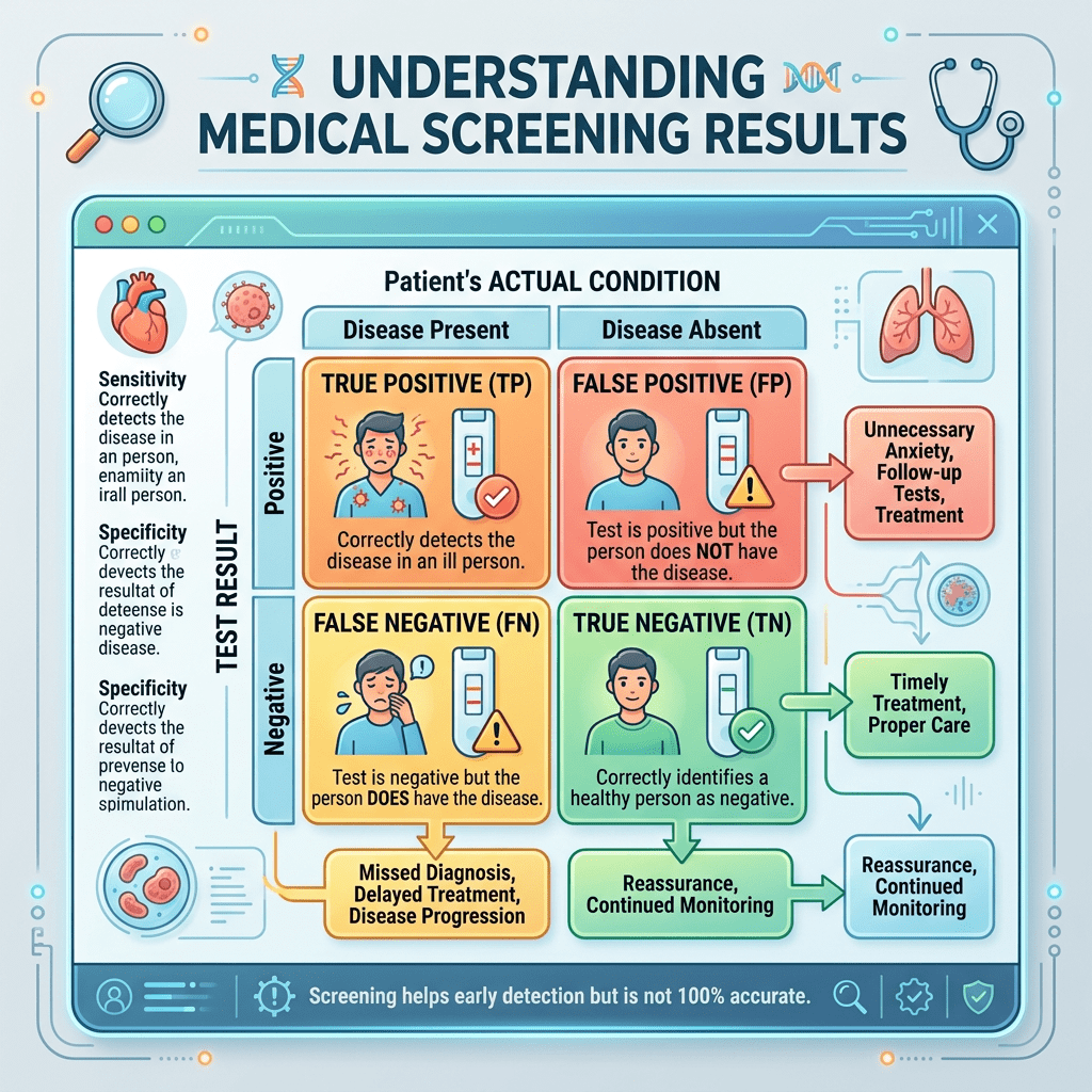
    Compute the positive predictive value at the real base rate. This is the base-rate lesson from earlier in the series applied directly. A test’s sensitivity and specificity are properties of the test, not of the answer a patient receives. What matters after a positive result is the positive predictive value, and that depends on how common the disease is. Suppose 5 of every 1,000 screened women truly have the cancer, the test catches about 87 percent of real cases, and it is about 89 percent specific. A positive result then comes with roughly 4 true cancers for every 110 false alarms, so a positive mammogram carries something like a 4 percent chance of cancer. The other positives face anxiety and follow-up for a disease they do not have, and for a rarer disease the predictive value is worse still.

    Finally, run the whole thing through the Wilson and Jungner checklist. The 1968 criteria still organize the judgment: the condition should matter, there should be a recognizable early stage, the test should be acceptable and accurate enough, the natural history should be understood, and the benefits should outweigh the harms and the costs. The criterion that quietly does the most work is whether treating the disease earlier actually changes its course. A program can have a fine test and still fail here, and when it does, it is detecting disease without helping anyone.

    Notice what these demands have in common. None of them asks how clever the test is or how much disease it finds. They ask about absolute benefit, measured at the right endpoint, weighed against the full ledger of harm imposed on the many people who can never benefit because they were never going to be harmed. A good screening program is not the one that detects the most. It is the one that prevents the most suffering per unit of harm it creates.

    That is general evaluation logic wearing a lab coat. Demand the right endpoint, express the effect in absolute terms, count the harms next to the benefits, and judge against criteria set in advance. Replace screening program with any program, and the discipline does not change at all.

    So here is my question. The next time a program is offered to you with an impressive relative number and a count of successes, do you ask for the absolute benefit, the right endpoint, and the full list of harms before you are convinced?

  • Understanding the Risks of Early Detection in Health Screening

    Few ideas in health feel more obviously correct than this one: catch the disease early, and you will do better. It is intuitive, it is often true, and it has driven decades of screening campaigns. So let me say clearly at the start that screening saves lives for several conditions, and nothing here argues for abandoning it. The argument is narrower and more uncomfortable: screening is not always beneficial, it can do net harm, and the reflex to detect everything earlier deserves more scrutiny than it usually gets.

    Start with why early detection helps only sometimes. Finding a disease sooner changes the outcome only if acting sooner changes its course. For some diseases it does. For others, the timing of detection does not change where the story ends, and moving the diagnosis earlier only means the person lives longer as a patient, not longer overall.

    That hides a measurement trap that makes screening look better than it is. Three biases inflate its apparent benefit:

    1. Lead-time bias. Move the diagnosis date earlier and you lengthen survival measured from diagnosis, even if the date of death does not move at all. People appear to survive longer when all that changed was the starting line.

    2. Length-time bias. Screening preferentially catches slow-growing cases, because they sit in the detectable but silent stage far longer. The fast, aggressive cases tend to surface as symptoms between screening rounds. So screen-detected disease is a gentler, more survivable sample of the disease to begin with.

    3. Overdiagnosis. The extreme of length bias. Screening detects disease that never would have caused symptoms or death in the person’s lifetime. These patients cannot be helped, because there was nothing to prevent. They can only be harmed by the treatment that follows.

    This is why counting cancers caught early, or comparing survival rates, is the wrong yardstick. Both are inflated by the biases above. The honest measure is whether screening lowers mortality, ideally death from all causes, in a fair comparison. Optimizing the easy proxy, cases found, instead of the real goal, deaths prevented, is the same trap this series flagged with Goodhart’s law.

    The false-positive problem compounds this, and it is a base-rate problem in disguise. When a disease is rare, even an accurate test produces many more false alarms than true findings, so a positive result can mean far less than it seems. Across repeated rounds of screening, the chance of at least one false positive climbs steadily, and each one can bring anxiety, follow-up procedures, and biopsies that carry their own risks. False negatives, in turn, deliver false reassurance.

    The cautionary cases are real and well documented. When South Korea added thyroid ultrasound to routine screening, thyroid cancer diagnoses rose roughly fifteenfold over about two decades while deaths from thyroid cancer stayed flat, a textbook overdiagnosis epidemic that produced a wave of thyroid surgeries, each with real complications. Infant screening for neuroblastoma, tested in controlled studies in Germany and Canada, raised detection substantially but did not reduce advanced disease or mortality, and Japan ended its national program. The long debates over PSA testing and over mammography turn on these same trade-offs, which is why expert bodies have moved toward individualized decisions and still disagree about exactly when and how often to screen.

    None of this means early detection is a myth. It means screening is a medical intervention like any other, with benefits and harms to be weighed for each disease and test, not assumed. The classic checklist, from Wilson and Jungner at the World Health Organization in 1968, still holds: the condition should matter, there should be a recognizable early stage, the test should be acceptable, treatment should work better when started earlier, and the benefits should outweigh the harms and costs. Cervical and colorectal screening clear that bar convincingly. Others clear it only for certain ages or risk groups, and a few do not clear it at all.

    So yes, we should temper the demand. Early detection is a means, not an end. The end is less suffering and fewer deaths, and screening earns its keep only when it delivers them. The mature position is not screen everything or screen nothing. It is to ask, honestly and disease by disease, whether finding this earlier actually helps, and to tell people the whole story, including the harms, not only the reassuring half.

    So here is my question. When you see a screening program promoted with survival rates and cases caught early, do you ask the harder question of whether it actually lowers mortality, and at what cost?

  • Why Programs Succeed or Fail: The Mechanism Explained

    “Does the program work?” sounds like the most basic question an evaluator can ask. It is also close to unanswerable as written, because the same program routinely succeeds in one place and fails in another, for reasons that a simple yes or no can never hold. The honest answer is almost always: it depends. Realist evaluation takes that “it depends” seriously and turns it into a method.

    The starting point, set out by Ray Pawson and Nick Tilley in 1997, is that programs do not work the in the same way a drug is imagined to work. A program does not cause an outcome by itself. It offers resources, or opportunities, and what produces the result is how people respond to that offer. That response is the mechanism, and whether people respond one way or another depends on their context. The same job-training program can lift employment for one group and do nothing for another, not because the program changed, but because it set off different reasoning in a different setting.

    This reframes the unit of analysis. Instead of asking for the average effect, realist evaluation asks for a configuration: in this context, what mechanism does the program trigger, and what outcome follows? The product of the evaluation is a set of these context-mechanism-outcome statements. In this context, for these people, this mechanism fired and produced this result; in that context, a different mechanism fired and produced something else. The aim is to explain the pattern, not just to detect it.

    Contrast that with the familiar experimental question. A clean trial treats the program as a black box and estimates its average effect on the people in the study. That is valuable, but it tells you whether the box worked on average, in this sample, not why, for whom, or whether it will work anywhere else. A program with a healthy average effect can still be useless or harmful for a sizable subgroup, and a program judged a failure may have worked well wherever the context was right. The average can hide the mechanism completely.

    The payoff for getting this right is transfer. When you know the mechanism and the conditions it needs, you have something you can carry to a new site and reason about in advance: this works when these conditions hold, so here is what to expect somewhere new. “The program works” does not travel. “This mechanism fires when these conditions are present” does. For a decision-maker weighing whether to scale or adopt, that is usually the more useful kind of knowledge.

    None of this is free. Realist evaluation is demanding. It requires a theory of the mechanisms before you start, data on context and not merely on outcomes, and the discipline to test and refine your configurations rather than narrate them. It is less tidy than a single headline number, and it resists the clean summary that sponsors often want. It also carries a real risk: without specifying what would count as disconfirming, a set of context-mechanism-outcome stories can slide into unfalsifiable explanation. The rigor lives in stating the conjectures clearly and putting them to the data.

    For those of us working in federal evaluation, this is not abstract. Programs run across wildly different sites, populations, and conditions, and a single effect averaged over all of them can be both technically correct and practically worthless. A program office deciding where to expand and where to pull back is rarely served by “it works.” It is served by knowing what works, for whom, under what conditions, and through what mechanism. That is the question worth the effort, even when it refuses to fit on one line.

    So here is my question. When you report that a program works, do you also specify for whom and under what conditions, or does the average effect quietly stand in for the whole story?

  • Avoiding Confirmation Bias: The Importance of Negative Cases

    In qualitative analysis there is a quiet, dangerous pull. You form an interpretation early, often in the first few interviews, and from then on the data seem to cooperate. Each new account appears to confirm the pattern. The theme feels stronger with every quote you add to it. But a stack of confirming cases is weak evidence, because you were never really looking for anything else. The strength of a qualitative claim does not come from how many examples support it. It comes from how hard you looked for the ones that do not.

    That discipline has a name: negative case analysis. It means deliberately searching your own data for instances that do not fit the interpretation you are building, and then taking those instances seriously. It is one of the established techniques for qualitative credibility, named by Lincoln and Guba alongside prolonged engagement, triangulation, and peer debriefing. And it is the qualitative cousin of an idea I return to often: you learn far more from trying to break your account than from trying to confirm it.

    This is the direct antidote to confirmation bias in interpretive work. Left to its own devices, the mind notices what fits and quietly explains away what does not. Negative case analysis reverses the question. Instead of asking what supports my theme, you ask what would contradict it, and then you go looking to see whether that contradiction is sitting in your data already. The cases that do not fit are not noise to be smoothed over. They are often the most informative material you have.

    The mechanics are straightforward, even if the honesty they require is not. Once you have a candidate interpretation, you go back through the data hunting for the disconfirming instance: the participant who did the opposite, the account that cuts against the pattern, the exception that the tidy version of your finding would prefer to ignore. When you find one, you do not delete it. You change the theory. Either the interpretation widens to absorb the case, or it narrows and gains a boundary condition, this holds here, but not there. Each negative case either kills a claim or sharpens it. The grounded-theory tradition does this continuously through constant comparison, but any careful analysis can do it on purpose.

    Here is the part that surprises people. Hunting for disconfirmation makes your findings more credible, not less. A claim that has survived a real search for counterexamples is far stronger than one propped up by a dozen agreeable quotes. And the boundary conditions you uncover along the way, the places where the pattern holds and the places where it breaks, are frequently more useful than the pattern itself. Knowing where a finding stops applying is knowledge, not weakness.

    A note of honesty is required, though. This only works if you are genuinely willing to be wrong, which is harder than it sounds when you are facing a deadline and you like the story your data are telling. It is also not a license to throw out a well-supported interpretation the moment a single odd case appears. The discipline is to engage the exception, understand why it differs, and decide whether it revises the claim, bounds it, or truly overturns it. Writing down that reasoning, rather than burying the case, is itself part of the rigor.

    In evaluation, this has real teeth. Qualitative findings often drive recommendations, and recommendations move money and programs. So when a comfortable consensus forms, when the report is gliding toward everyone agrees the program is working, the right reflex is to ask who did not agree, and whether anyone went looking. The dissenting site, the participant who dropped out, the frontline staffer who pushed back: those are the negative cases, and they are usually where the real lessons are hiding. Actively seeking them is what protects you from a flattering conclusion that happens to be false.

    So here is my question. When you reach a confident qualitative finding, do you stop and search for the case that would break it, or does the search quietly end once the pattern feels strong enough?

  • Hindsight Is Not Insight

    After a program fails, the review almost writes itself. The warning signs were there all along. The decision looks negligent. Surely someone should have seen it coming. The trouble is that most of this clarity is manufactured. It appears only after you learn the outcome, and it quietly rewrites your memory of how uncertain things really were at the time.

    Psychologists call this hindsight bias, or creeping determinism. In a classic 1975 study, Baruch Fischhoff showed that once people are told how an event turned out, they raise their estimate of how predictable it had been, and they misremember their own earlier guesses as closer to the truth. Knowing the ending makes the whole story feel inevitable. People given the outcome inflated the probability they claimed they would have assigned beforehand, by a meaningful margin.

    There is a closely related trap. We judge the quality of a decision by how it turned out, rather than by what was known when it was made. Jonathan Baron and John Hershey demonstrated in 1988 that the same choice is rated as wise when it ends well and foolish when it ends badly, even when people are told the available information was identical and are instructed to ignore the result. A sound bet that loses still gets graded as a bad bet. The name for this one is outcome bias.

    This is an occupational hazard for anyone who evaluates programs and decisions after the fact, which is most of us. With the outcome in hand, a failed initiative looks obviously doomed and its leaders careless, while a success looks inevitable and its strategy brilliant. Both readings are distorted by the same mechanism. We end up praising luck and punishing sound judgment that happened to draw a bad card.

    The damage runs deeper than unfair reviews. We learn the wrong lessons. If every bad outcome is treated as a bad decision, we teach people to avoid reasonable risks and to manage appearances instead of making good calls. We also miss the dangerous cases, the good outcomes that came from poor reasoning and simple luck, which are exactly the ones likely to fail next time. Hindsight does not just misjudge the past. It corrupts what we carry forward.

    The fixes have to be deliberate, because the bias is automatic. Judge the decision by what was knowable at the time, and reconstruct the information and constraints the decision-makers actually faced. Hold apart two questions that hindsight fuses: was this a good decision, and did it turn out well? They are not the same. Where you can, write down predictions and reasoning before the outcome is known, so you are not rebuilding them later through the fog of the result. And use the debiasing move with the best evidence behind it: deliberately ask how things could have gone differently, and why a careful person might have chosen as they did.

    For those of us in evaluation, lessons-learned reviews and after-action reports are where this bias does its quietest work. The disciplined approach is to reconstruct the decision as it looked going in, to credit sound process even when results disappointed, and to resist the satisfying story in which everything that happened was always going to happen. The aim is to learn what was actually learnable, not to enjoy the false comfort of a tidy, inevitable past.

    So here is my question: When you review a project that went badly, do you separate the quality of the decision from the quality of the outcome, or does the result color the whole assessment?

  • Understanding Colliders in Statistical Models

    There is a piece of advice that sounds responsible and is sometimes exactly wrong. When you worry that a comparison might be confounded, the reflex is to control for more variables, to put everything into the model just to be safe. But some variables do not remove bias when you control for them. They create it. They can manufacture a relationship that was never there.

    The troublemaker has a name: a collider. A collider is a variable that is a common effect of two others, two arrows pointing into it. When two things both influence a third, something strange happens if you hold that third thing fixed, by adjusting for it, stratifying on it, or restricting your sample to it. The two causes become artificially correlated, even if they had nothing to do with each other. Conditioning on the common effect opens a path that was supposed to stay closed.

    An example makes it concrete. Imagine a selective program that admits people who are strong on either a written test or an interview. Across all applicants, test and interview scores might be unrelated. But among those admitted, they will look negatively correlated: someone who got in with a mediocre test probably had a strong interview, and the reverse. The negative relationship is purely an artifact of selecting on admission, the collider. Nothing about the applicants changed. The sample did.

    This is not a classroom curiosity. The oldest version is Berkson’s paradox, described in 1946: study only hospitalized patients and two unrelated conditions can appear linked, because each one raises the chance of being hospitalized. A modern version is the obesity paradox. In the general population, obesity raises mortality, yet among patients who already have heart disease, it can appear protective. Heart disease is a collider, a common effect of obesity and other risk factors, and conditioning on it distorts the picture. Adjust for the wrong variable and a harm can look like a benefit.

    Here is what makes this genuinely hard. It is the mirror image of confounding. A confounder is a common cause of the treatment and the outcome, and you must adjust for it to get the right answer. A collider is a common effect, and you must not. The two can look identical in a dataset. The only way to tell them apart is to reason about the causal structure, which arrow points where, before you decide what goes into the model. The numbers alone will never tell you.

    This is why the comforting rule, control for everything you can measure, is wrong. Some of those variables are colliders. Others are affected by the treatment itself, which makes them colliders too. Adding them all does not buy safety; it can introduce bias that was not there before. And, as in a recent post, more data does not save you: a larger sample just pins down the distorted association more precisely.

    So the real move is conceptual, not statistical. Before you adjust for a variable, ask what causes it. If the treatment or the outcome, or the things that drive them, influence that variable, leave it out. Causal diagrams exist precisely to make these choices visible, marking which variables are confounders to control and which are colliders to avoid. The urge to control for more should give way to controlling for the right things.

    In evaluation, this hides in plain sight. We restrict samples to program completers, or to those who responded, or to sites that reported data, and we load models with covariates to look thorough. Every restriction and every control can remove bias or create it. Selecting on completion, response, or survival is conditioning on a collider, the same trap in a different coat.

    So here is my question: When you choose your control variables, do you reason about what causes what, or does the list come from whatever happens to be in the dataset?